The Problem
Picking a prompt
For the first project in our class we had two prompts to pick from when we where deciding where to start for a project. The two project scopes we could choose from were either the Michigan football fan experience, the roommate experience, travel experience, or career placement (including internships or jobs). I chose the roommate experience since I was inspired by a friend I had where she told me that she had to live on her own since there was no one that could cater to the stricter living conditions she needed to maintain a healthy and tolerable quality of life.
Creating a problem statement
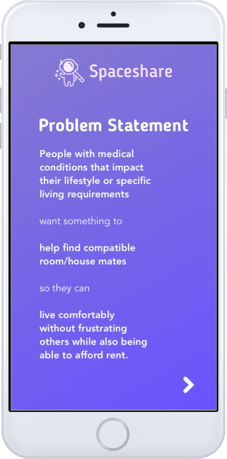
My problem statement began as "People with medical conditions that impact their lifestyle or specific living requirements want something to help find accommodating and compatible room house mates so they can live comfortably without frustrating others while also being able to afford rent". I was trying to target users similar to my friend that first inspired the whole idea, and connect others who were like minded and would be compatible despite medical conditions. I wanted to make the affordable housing market accessible to others such as my friend. As I went on I was able to tweak and adjust my problem statement but the core idea remained the same.
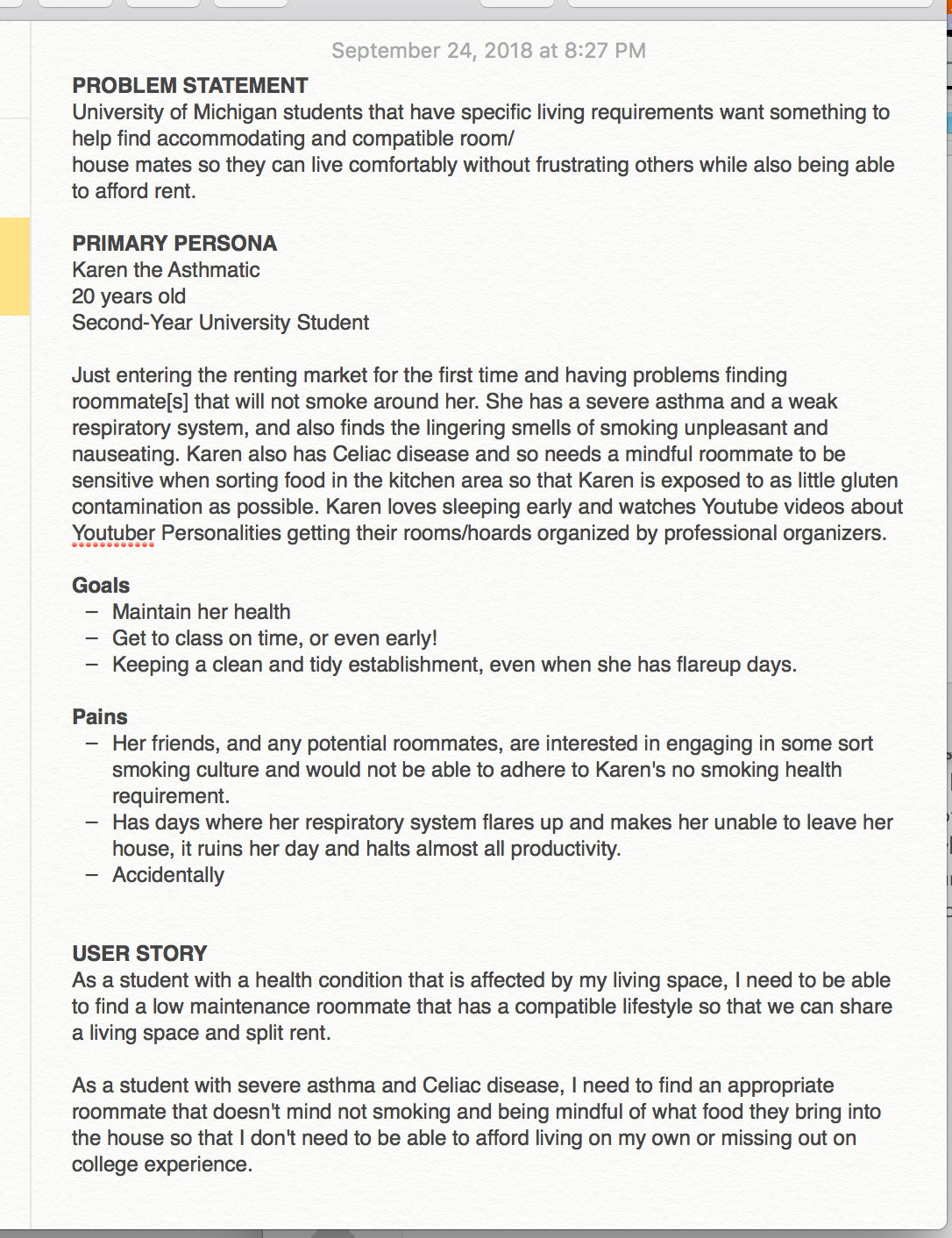
Identifying a persona and primary user
I built a primary user persona around someone like my friend and others. My persona was health conscious and had medical conditions that meant that she couldn't just simply compromise or let transgressions slide since the impact would be extremely detrimental. This user is someone that needs to find a roommate that has similar conditions that would compel them to adhere to strict rules since their own conditions motivate them.
The Process
What's already in the market: Researching similar apps and competitors
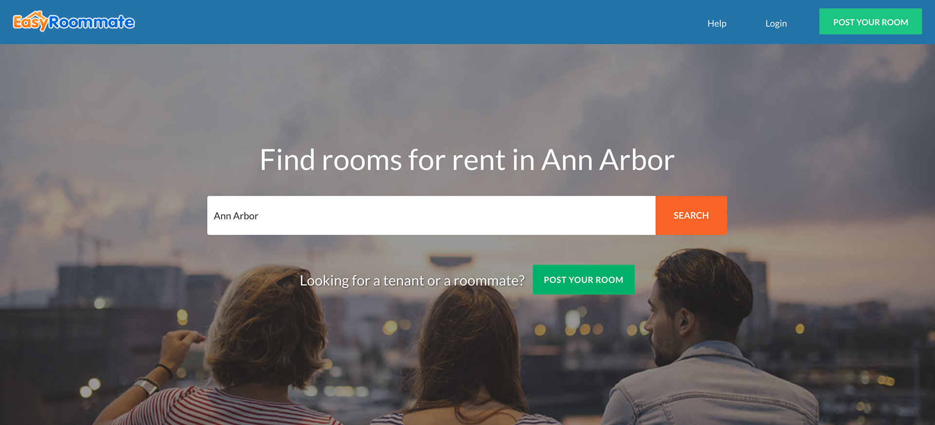
I first did some basic research before tackling anything. I didn't really know where to start. On the roommate experience side, I looked to Roomster, EasyRoommate, and roommates.com. I even signed up for some of these apps to help me see what questions they asked to determine compatibility, what would be useful to potential users, and how they presented information when they matched you.
I also looked to trending dating apps such as Tinder, since these apps try to take the lengthy matching process and pare it down to the fastest but still effective process.
My research helped informed me on how I wanted to present my features and information, while understanding what has come before and how I need to improve the previous process.
First low fidelity wireframes: Organizing core features
My first wireframes were very basic and lackluster. I wasn't sure how to design from the square one. We were told to leave the wireframes in black and white and quite barebones so we would be forced to focus on the overall structure and features of the app.
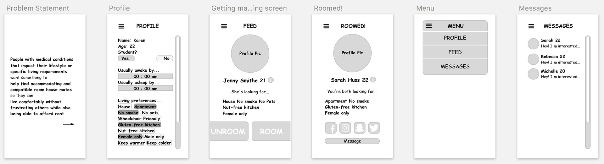
My initial idea was slightly reminiscent of Tinder since I wanted it to be fast and convenient. My user already had to deal with health issues and I didn't want to put them through another arduous and inconvenient process. I had a very basic idea of the on-boarding process, where the profile showed all the information my app would be asking. The navigation system was a bit of a cop out and I tucked away all my developing ideas and features away in the hamburger icon.
Interviewing the user: Designing with empathy
After turning in my initial wireframes I knew I wasn't happy with what I churned out. I didn't really know how to upgrade it, but online research has only helped me so much. I decided to go to my source and I set up a time where I could interview my friend that gave me the initial concept. After all, she was my target persona, and this was made to solve her problems. I sat her down and asked her a variety of questions and tried not to lead her. I wanted her honest opinion on what she was looking for exactly when looking for a roommate and why did she ultimately settle on living on her own. Was the inconvenience of finding a compatible roommate just not worth it? Or was it because she simple had no access to anyone that could match her criteria? I went through and organized the information she gave me, how she prioritized living features, and what her current process in finding roommates was now (and how it failed). I also gleaned a lot of information about new and different living features to include in the app I would've never thought someone would be sensitive to.
Second iteration: Adding color and features
After the interview, I went ahead and updated my initial prototype with everything I learned and tweaked the on-boarding process.
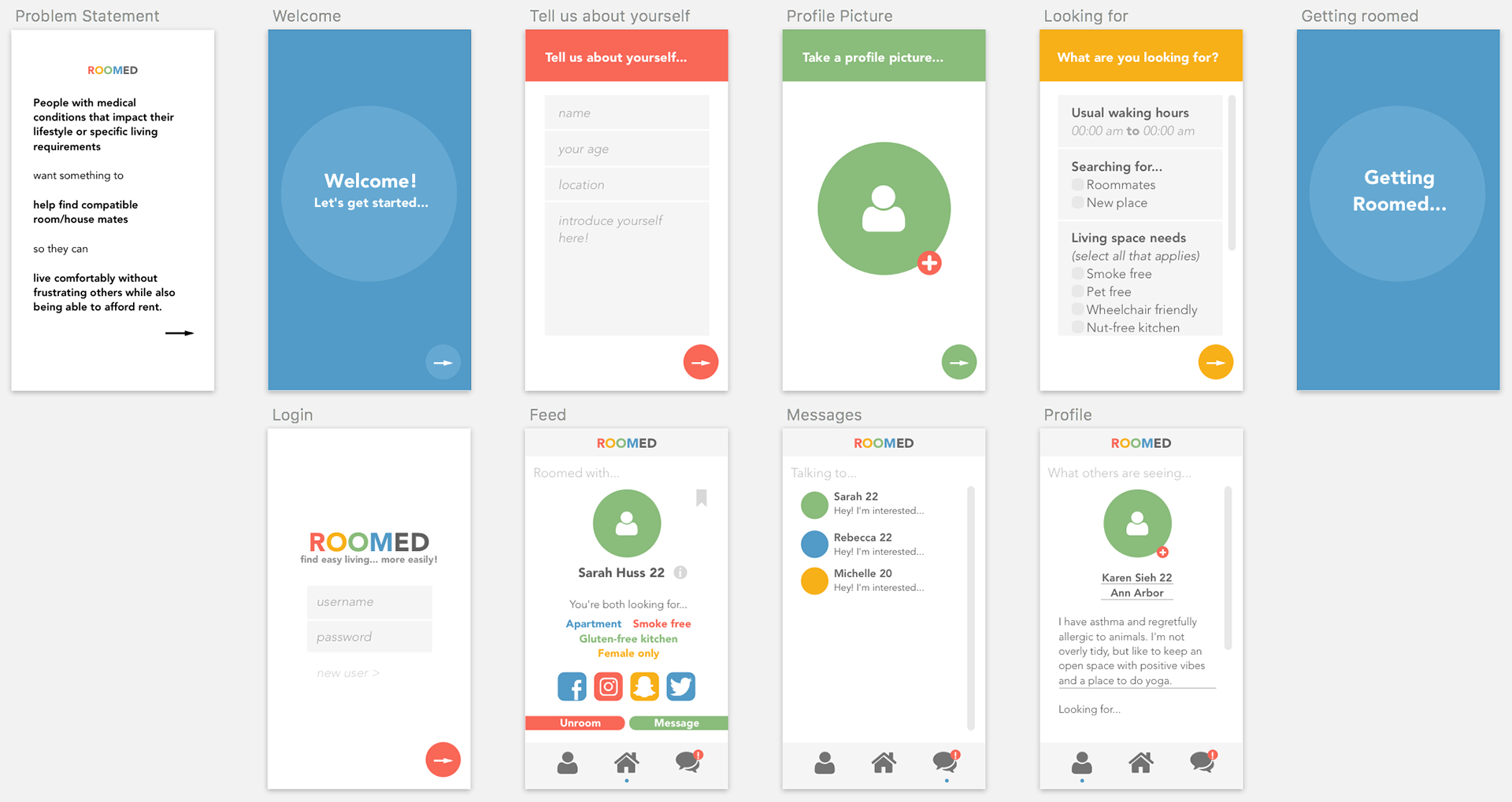
I wanted the on-boarding process to be as fast as possible while still remaining inviting and calm. I moved towards a better navigation system with the navigation bar on the bottom. I updated all the pages and screens with bright inviting colors. I avoided a boring monochromatic color palette because I wanted this app to be playful in a way that could distract from the monotony and inconvenience of searching for a specific roommate. I went for round shapes and icons to maintain this approachable aesthetic.
Coffee Chats: Making sure to stay grounded and check-in
After my second iteration I attended coffee chats where I was able to speak with one of the instructional assistants, Fabio. This was my chance to ask questions about features and ideas I was still waffling about on. This included the immediacy of having to decide right away if you wanted to message or reject a potential roommate, the icons of my features and the redundancy of the book mark feature. Fabio offered a lot of insight and useful advice while taking time to address my main concerns.
The Final Prototype
Third and final iteration: A high-fidelity mockup and enhancing the overall visual design
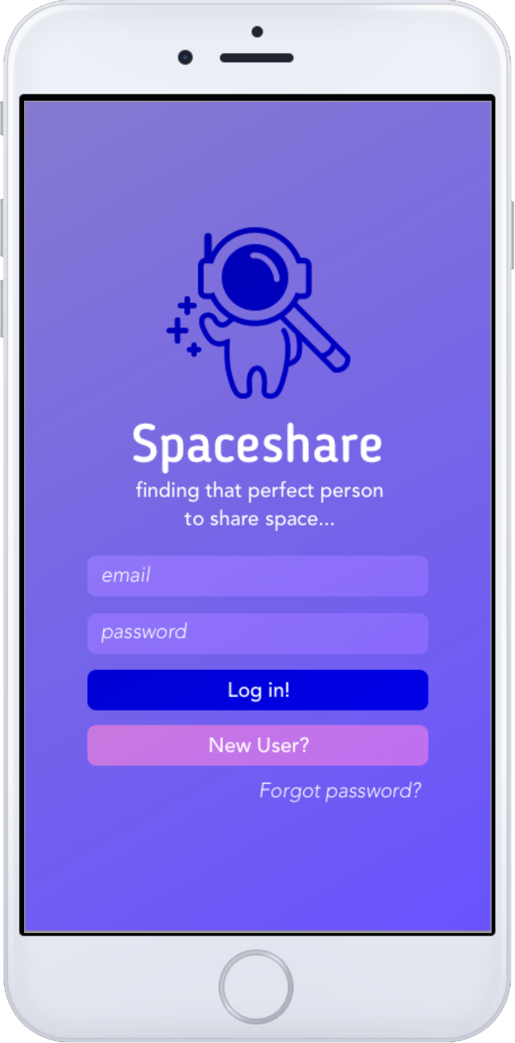
Ultimately, I veered away from the white and rainbow color scheme. I didn't want the app to look too childish and unprofessional, also risking the chance of seeming demeaning or insulting by comparing those with medical conditions to that of children. I completely redesigned the visual design of the app and went for a spacefaring and exploratory theme involving an astronaut.
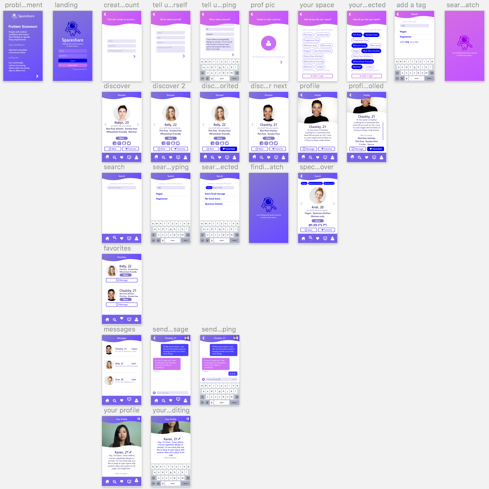
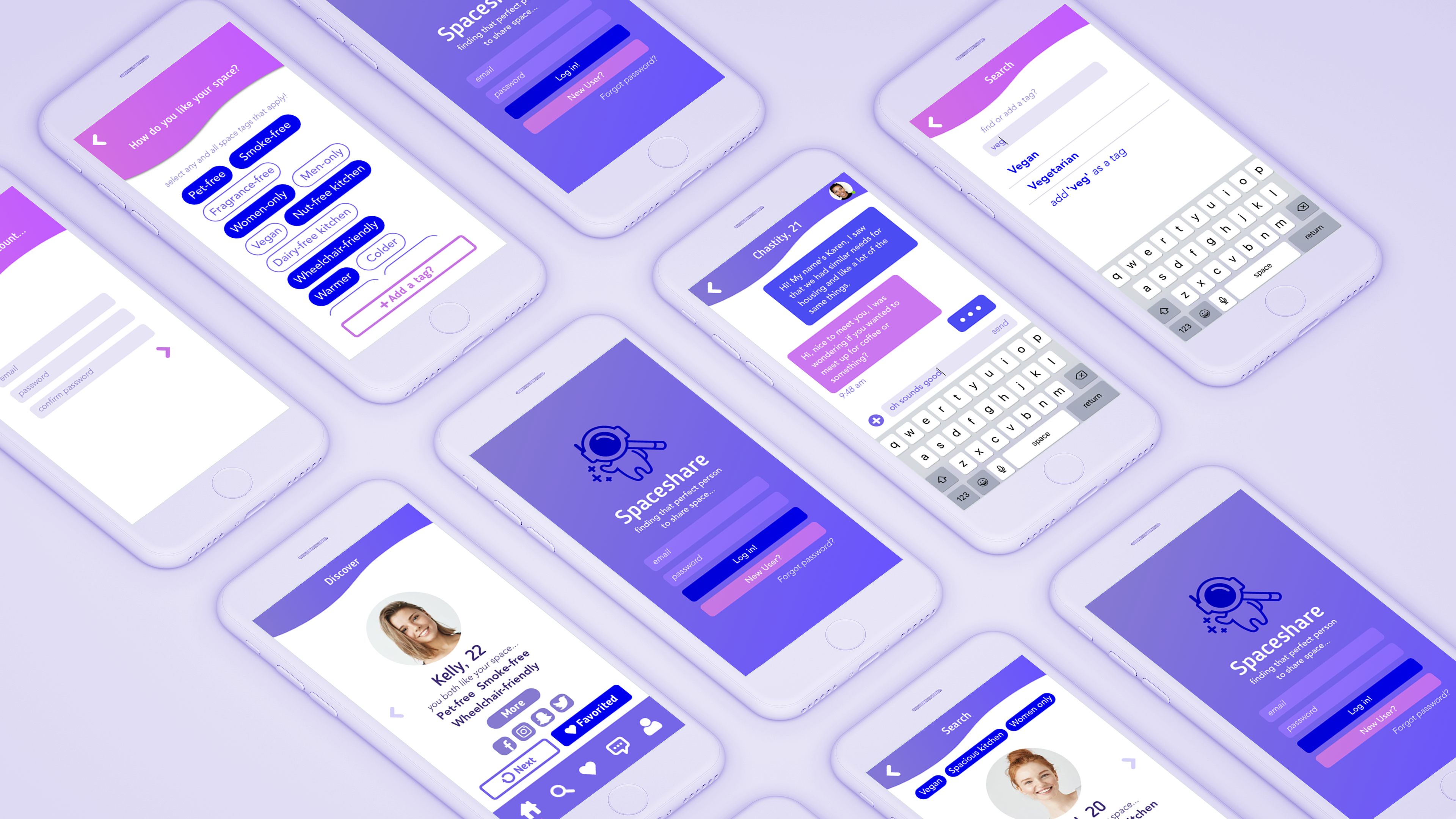
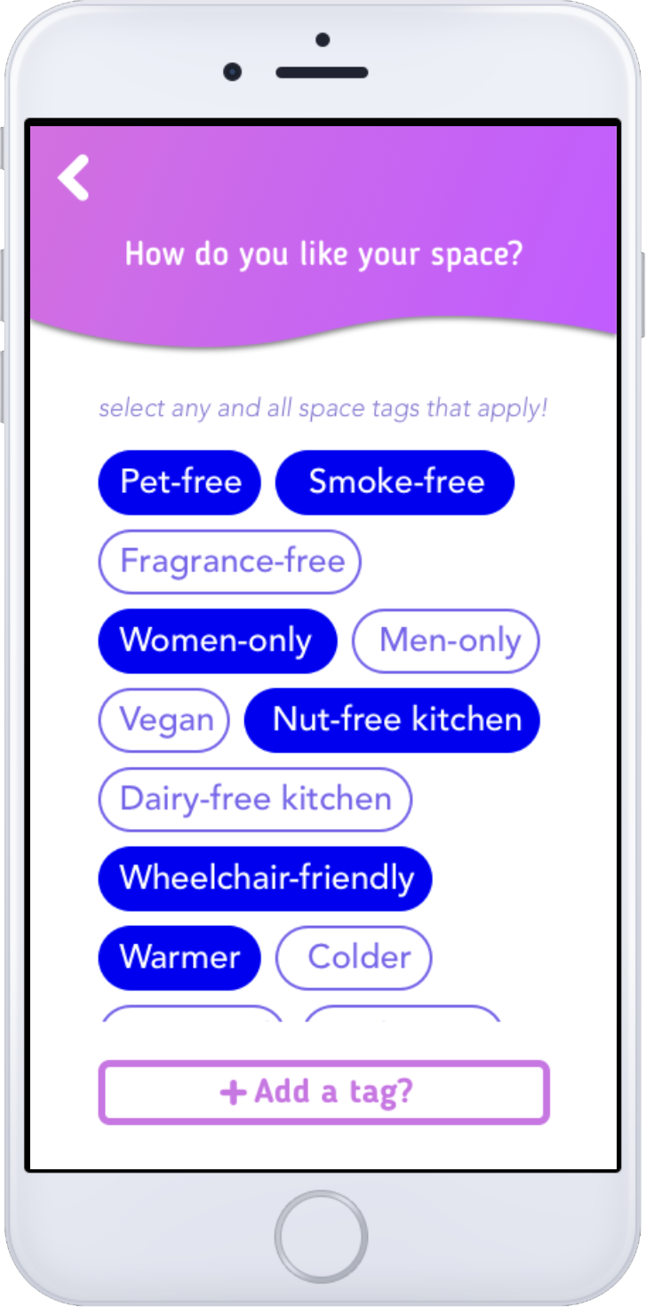
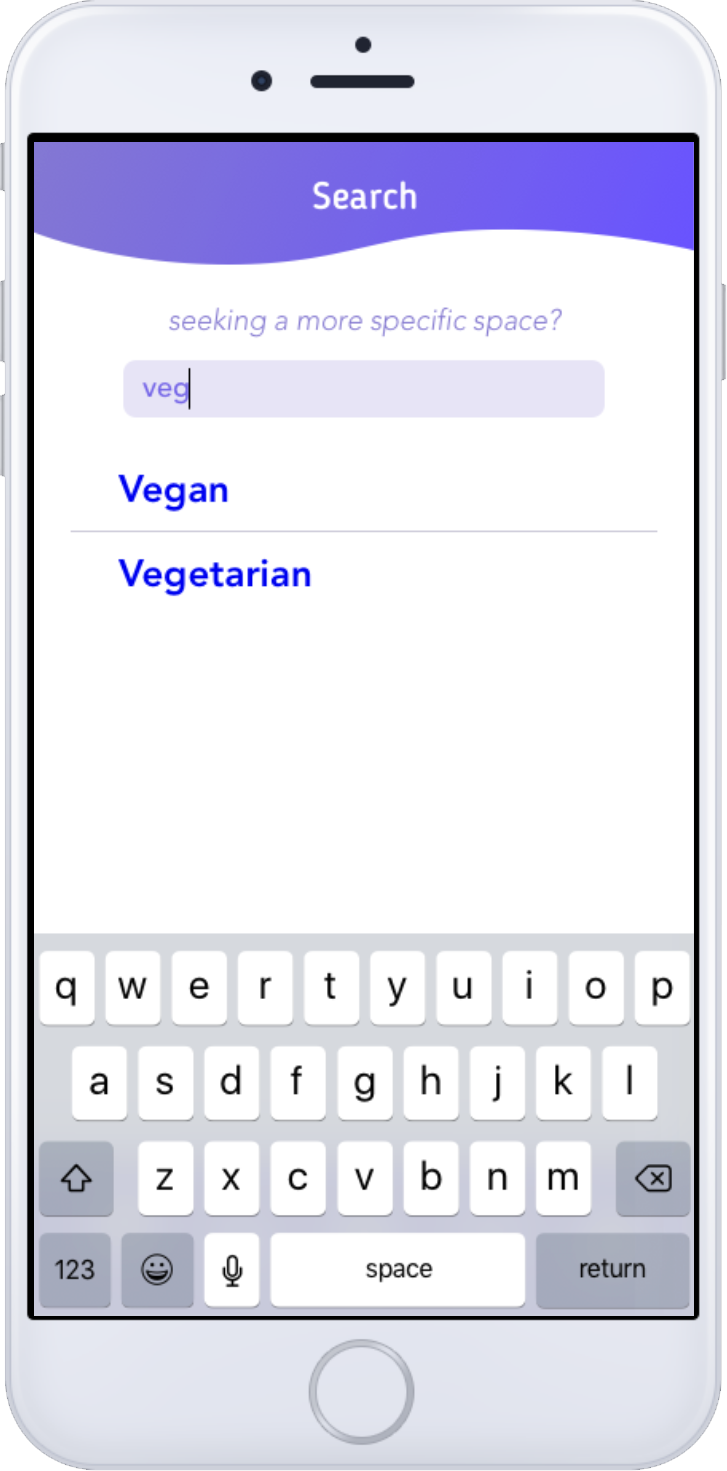
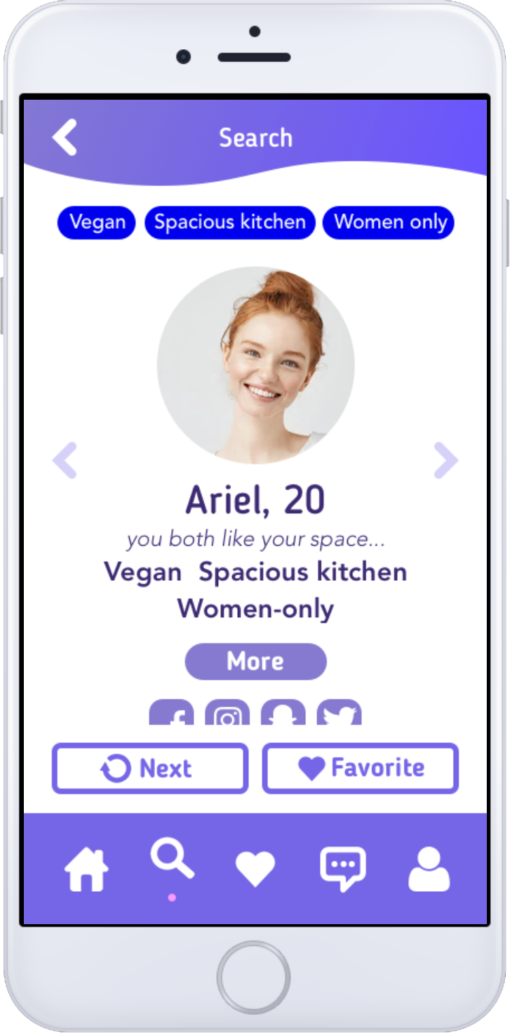
The title font and overall aesthetic kept with the same rounded ends and circles to evoke the shape of planets and keep the look and feel of the app still friendly and approachable (since you are approaching other humans afterall). I fleshed out the on-boarding process fully with account signup and the selection of tags while eliminating the profile options that were deemed unnecessary in coffee chats. I made sure to implement an option that allowed users to add their own tag so there was no chance of leaving someone out. I also fully realized the save/favorite feature, integrating it in a way that would lessen the immediacy problems I had in my last iteration. I was finally able to fully flesh out every screen of the navigation bar.
Reflection
Feedback
I was able to bring this app to my friend after I completed it and it was extremely validating and exciting for her to see it and approve of it. She let me know that she would definitely give it a shot if it was implemented successfully and if the community was large enough. She felt as if I addressed her personal problems adequately while allowing room for growth and accommodation of others.
Next steps
If I could add a feature it would be the inclusion of open housing, where housing could be listed and organized based of its price range and adequacy in fulfilling the tags of yourself and others you match with. It would also be able to allow you to list your own open spaces in your housing if say the user was looking to fill spaces in a home that they've already signed with.
Overall
The class taught the value of design as a reaction, emphasizing that designers are problem solvers who where responding to a gap in the market or a need for improvement. In a sense we were similar to engineers, addressing a problem and figuring out how to solve the problem and implement the solution.