Context
Internship at Gwydion
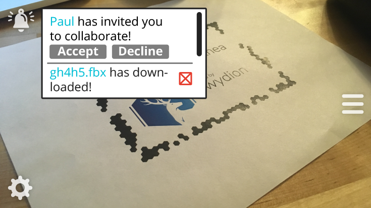
Over the summer of 2018, I had the opportunity to work at Gwydion, a virtual reality software company. The main platform they've been working on, Arthea, allows users to view, manipulate, and edit 3D content collaboratively in virtual reality. Arthea has become imperative in helping researchers and university students understand and engage with 3D material in a way they've never been able to before. Having only seen virtual reality through the lens of gaming, I was excited to be brought on to the team and understand how the 3D space impacts and helps industries outside of gaming such as pharmaceuticals, education, material science, dentistry, and more.
As an Art & Design Intern, my task was to develop, improve, and implement the designs of new features, integrating it with their existing user interface. Throughout the summer, the Gwydion team and my supervisor Gus Schissler assigned me a variety of tasks involving the integration the interface of new features into their existing platforms. I started on their web interface to introduce me to their existing features before ultimately working on a overhaul and redesign the UI of their VR platform: Arthea.
Web Platform Project
User Interface for Arthea.io: Updating and designing
for the web
for the web
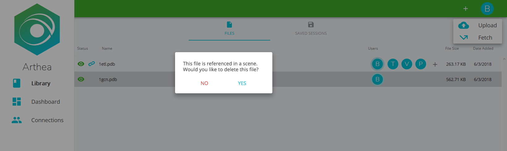
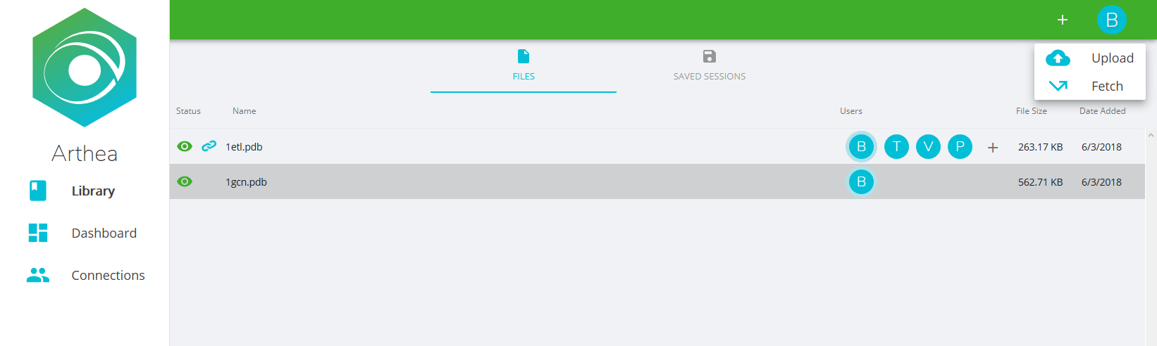
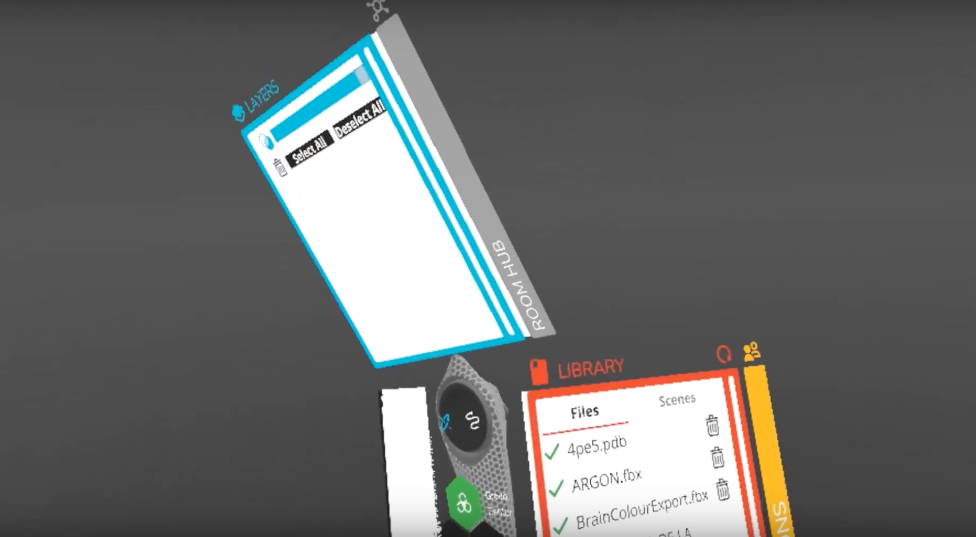
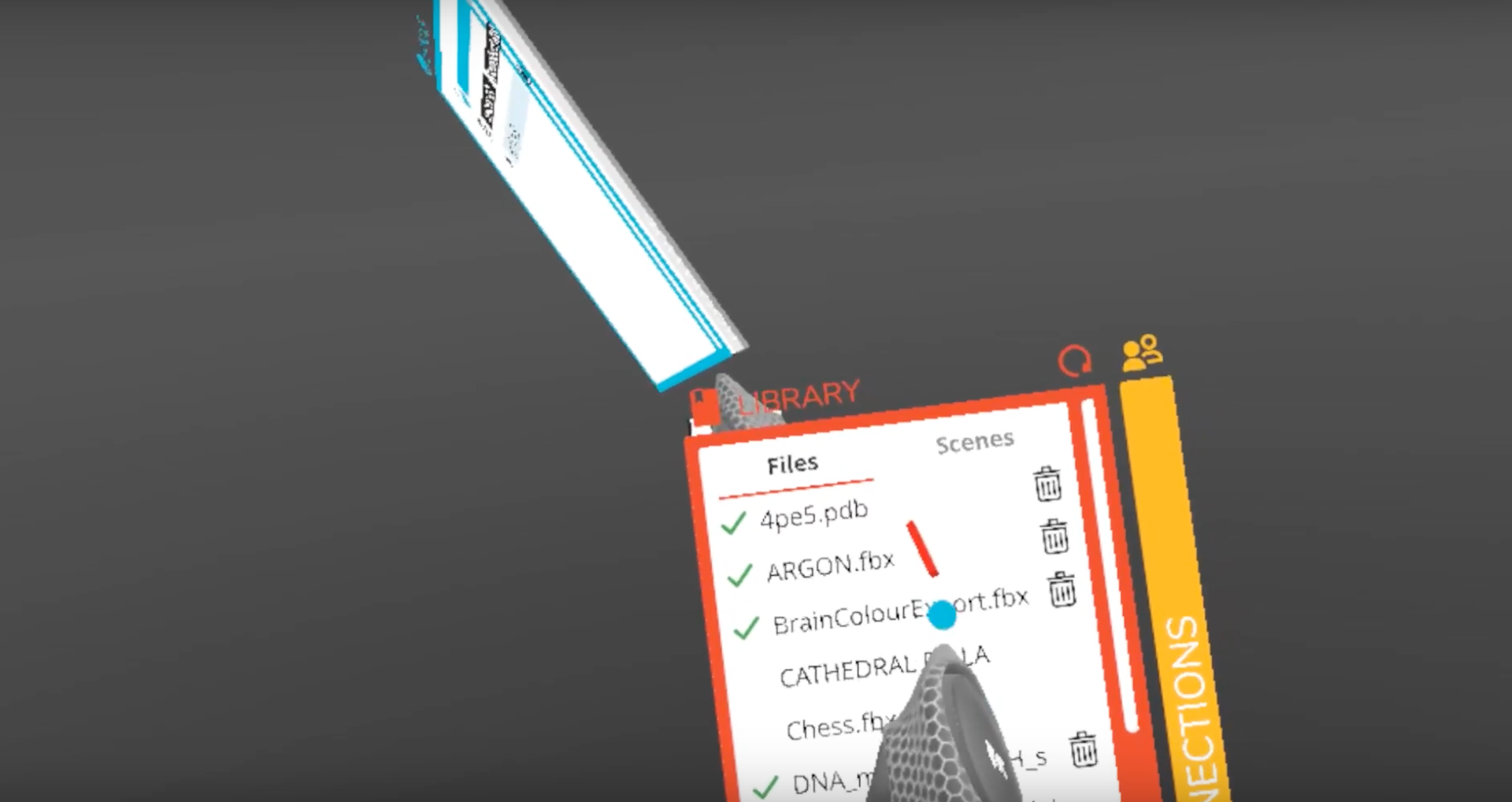
I spent the first month of my summer internship working on the user interface on their web platform, Arthea.io. During meetings the team would develop and pitch new features and ideas to be implemented in the website. Oftentimes, these features were solutions to obstacles noted by users explicitly or ideas that would address user needs and inconveniences observed during testing. With Arthea existing in multiple forms, these features would also need to be integrated into Arthea.io, the web platform.
To help acquaint me with their design principles and how the Design and Development teams worked in a pipeline, I was tasked with creating design mockups and documents to dictate how new features would look on Arthea.io.
Below you can see sketches of to-be-implemented features and high-fidelity mockups of the website.
Since designing for a website was a bit simpler, it was good first stepping stone to acquaint me with more common user interface concepts. I would take a look at the existing state of the web interface and see how new features, buttons, ideas, and symbols should fit into the existing site to make the hierarchy of organization and representations of new features feel intuitive and understandable to the user.
For a field such as virtual reality, most people would at least be familiar with the concept of the website, and it is so important to make the most accessible platform the most intuitive and convenient for our user.
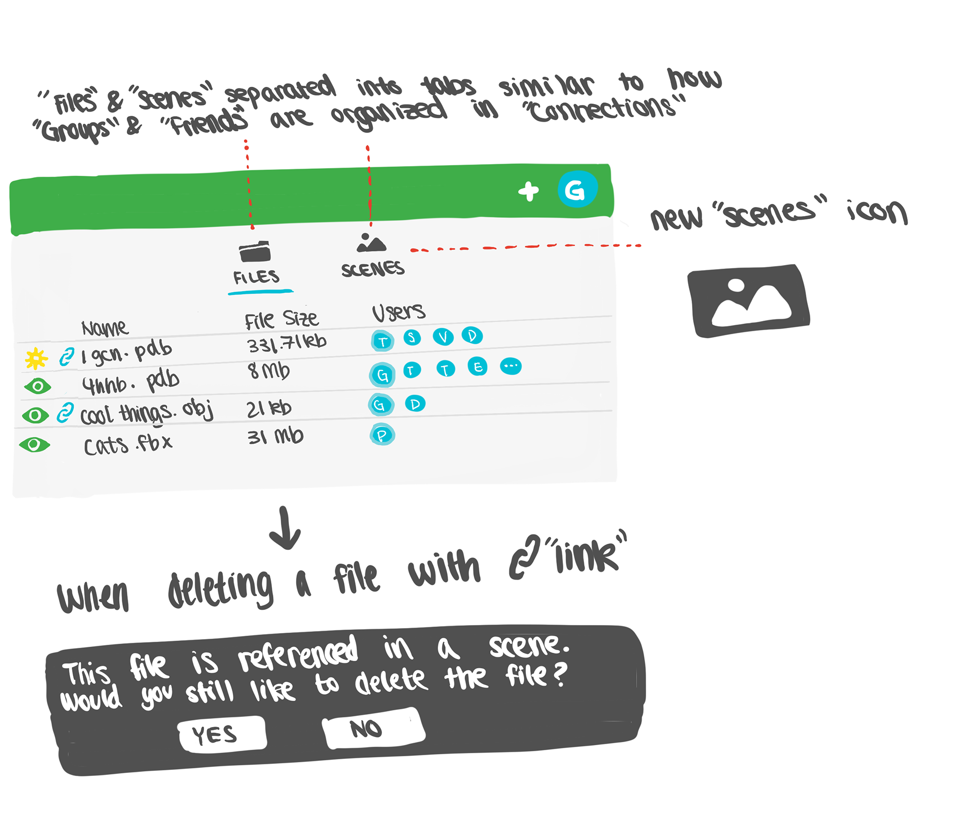
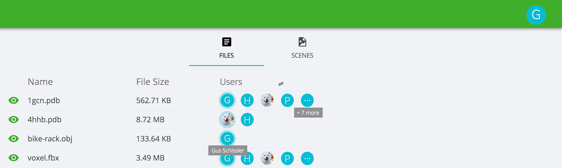
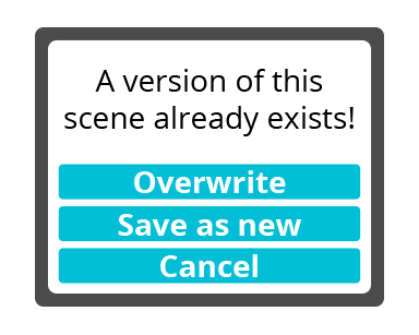
Below, there are some more high-fidelity mockups of how dialog boxes surrounding a new feature would look and how the inclusion of new format of files would look as tab menu system. These mockups would then be passed onto the Development team.
VR Platform Project
Redesigning the user interface for VR
After I became more comfortable with working with Arthea's web interface, my supervisor thought that it would be the perfect opportunity to have us begin redesigning the whole user interface for the virtual reality platform. It was an idea pitched at the before and now we finally had the resources to begin execution.
Creating the user interface for 3D space was daunting, as something I've never even considered before. I had to re-imagine and develop a whole new idea to overwrite what wasn't working before, conceptualizing and sketching in 2D to bring to life in three axes.
Conceptualizing and ideating
To start, we had to address and isolate what wasn't working before, the reason why we needed a UI overhaul in the first place. My supervisor and I consulted the rest of the team and did some testing ourselves to try and see what were the major obstacles for different groups of people. A large part of addressing these major issues was identifying what were some seemingly subtle but actually major inconveniences and user frustrations that could be totally reworked. It was important to find problems that the user didn't know they had.
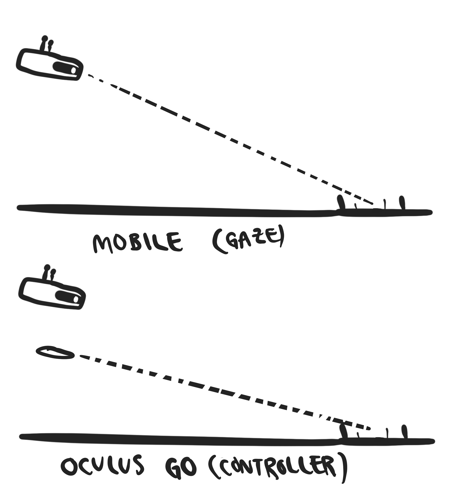
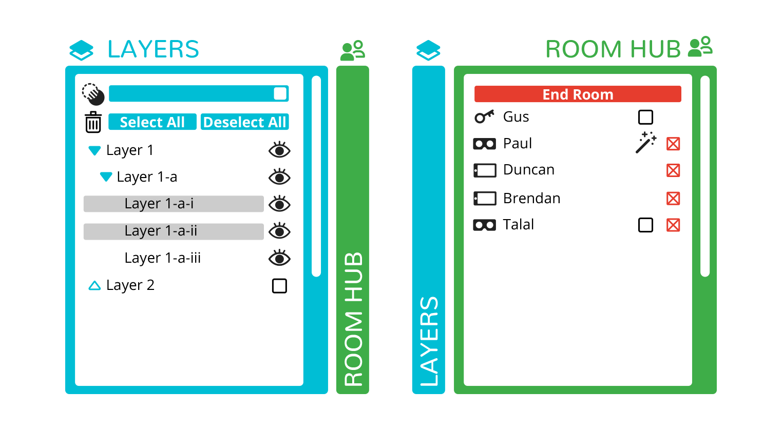
Below are some screenshots of the previous UI and the one we were to redesign. The panel system was not intuitive and one of the major problems was its placement in relevance to the spawn point of any 3D object and file that the user would be working with made the user twist and turn their body significantly to access both the file and menus in turn. The environment and ambient lighting also drastically changed the true colors of different models and files, strange for a platform that wanted you to see 3D objects accurately with others. These were just some of the issues we wanted to address going into the project.
My supervisor and I decided that we would ideate separately in order to come up with two completely different ideas that would allow us to have more options and ideas to draw from later when we come together with our fleshed out ideas.
We outlined the main ideas, problems, and feature flows first before we split off to make sure we wouldn't be in completely different fields of thought and settled on a timeline of feasibility.
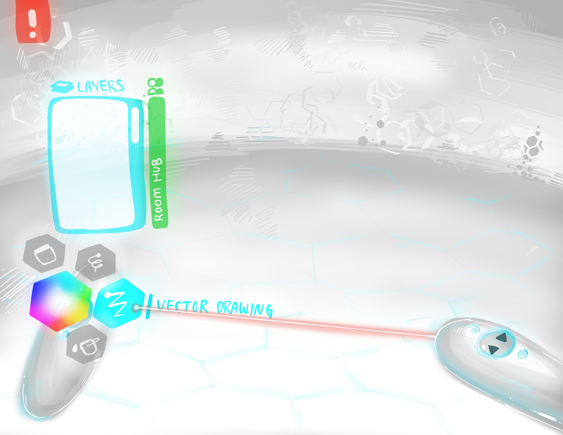
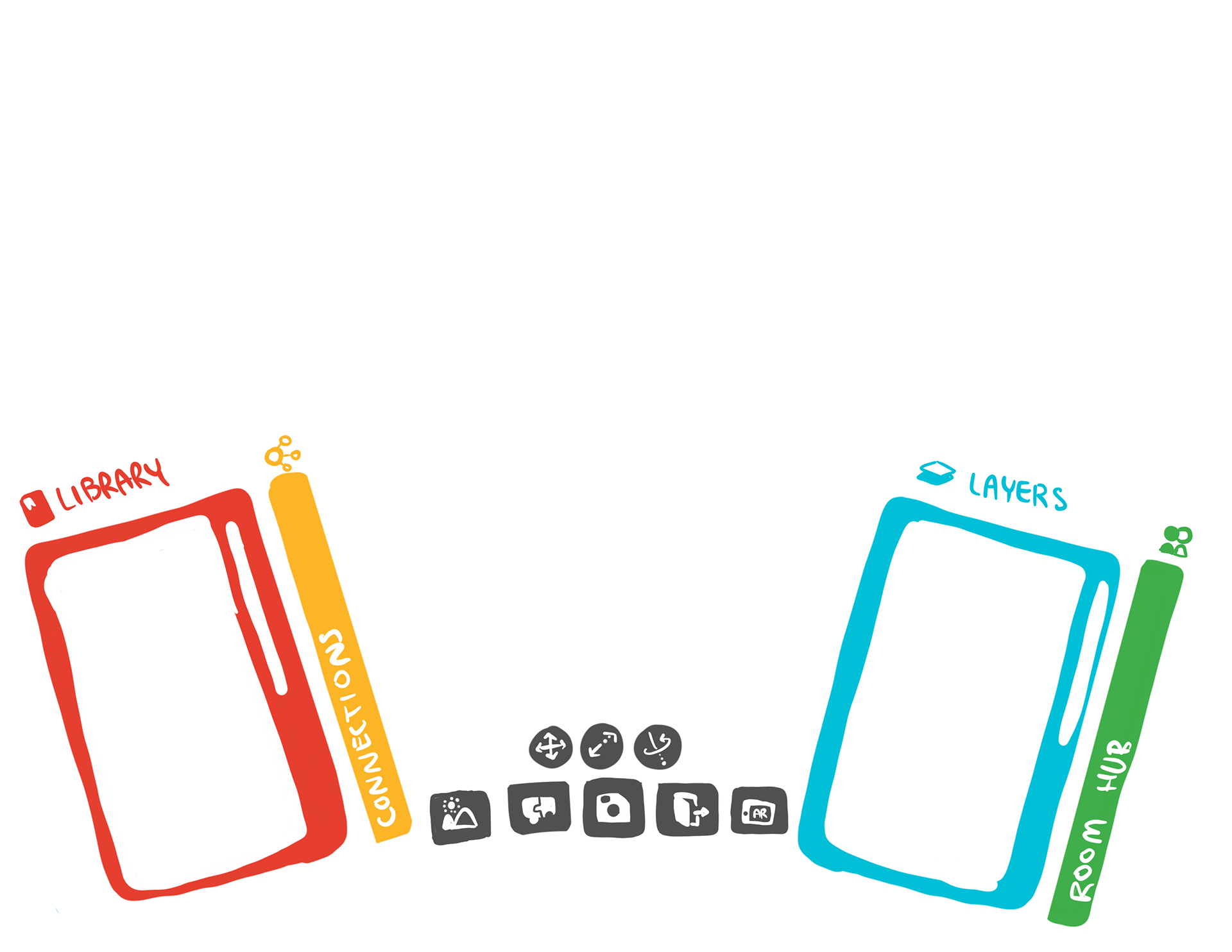
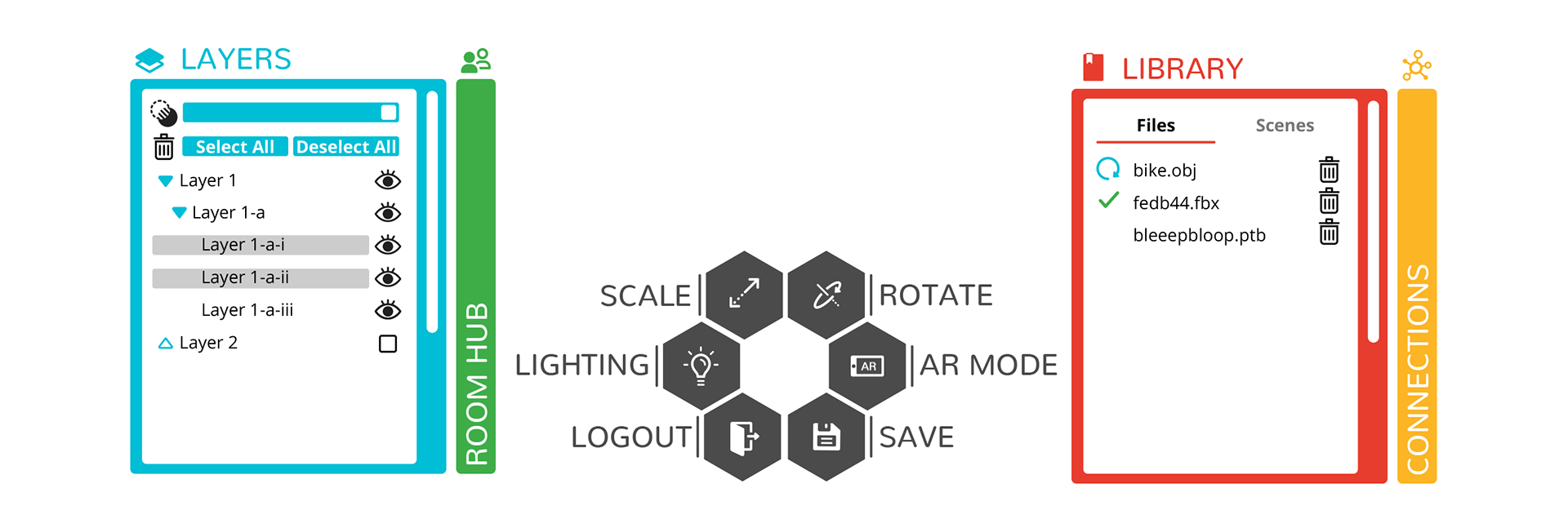
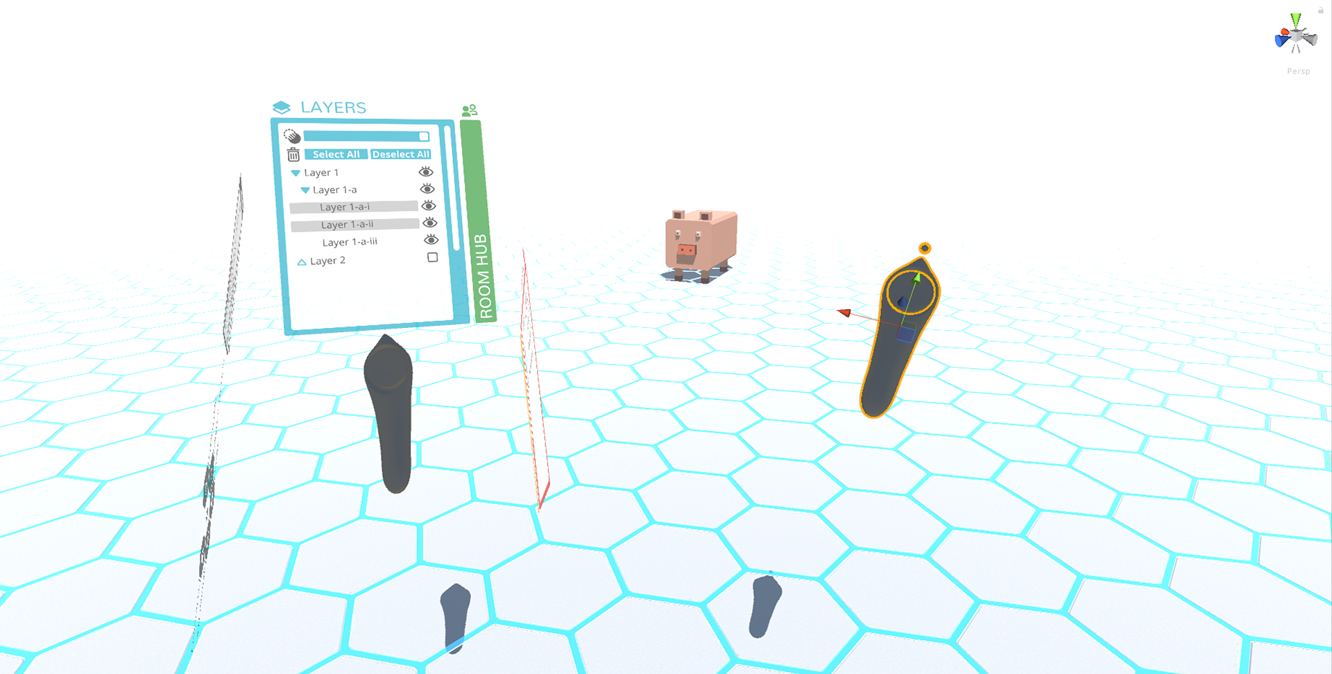
This was the digital painting I created, illustrating the final look and feel I envisioned for the final product. I wanted a bright but neutral environment, with a white background and theme that would be a clean canvas for any variety of 3D objects or files. This look was accented and given character by accents of color that would be drawn from Gwydion's signature color palette. To make the UI easier on the eyes, due to the resolution and pixel limitation in VR equipment, less small text was used and tool tips and glowing indications of what features were active or hover selected would be used. The use of Gwydion's hexagonal design characteristics were used throughout, as a tile pattern for the floor and in the modular menu system I imagined, imitating an artist's palette of sorts, that would be affixed to your controller.
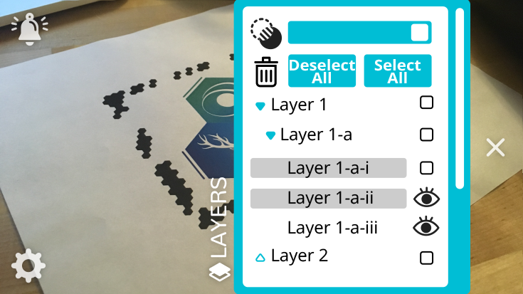
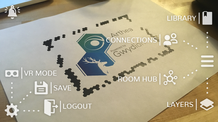
With the VR platform, I had to imagine a redesign for the mobile version of Arthea, and how the UI and menu system would look on a simplified version of virtual reality that had no controllers. Below was a mockup of this mobile menu system that recreated the same design characteristics established in the first concept art just modified for mobile.
Since the UI overhaul would affect VR, mobile, and AR versions of Arthea, the redesigns had to look cohesive across platforms while addressing the individual needs and issues of these different outlets.
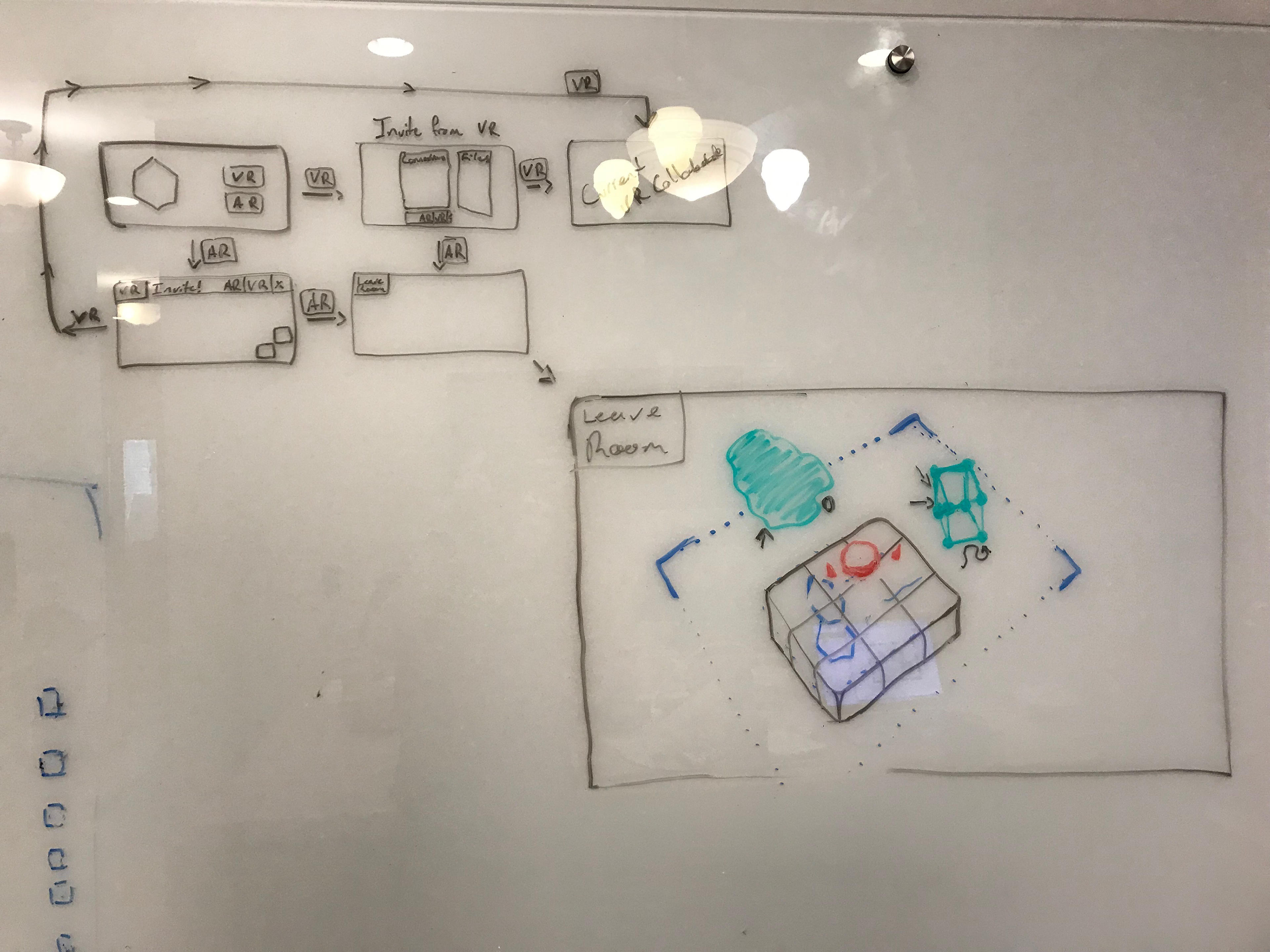
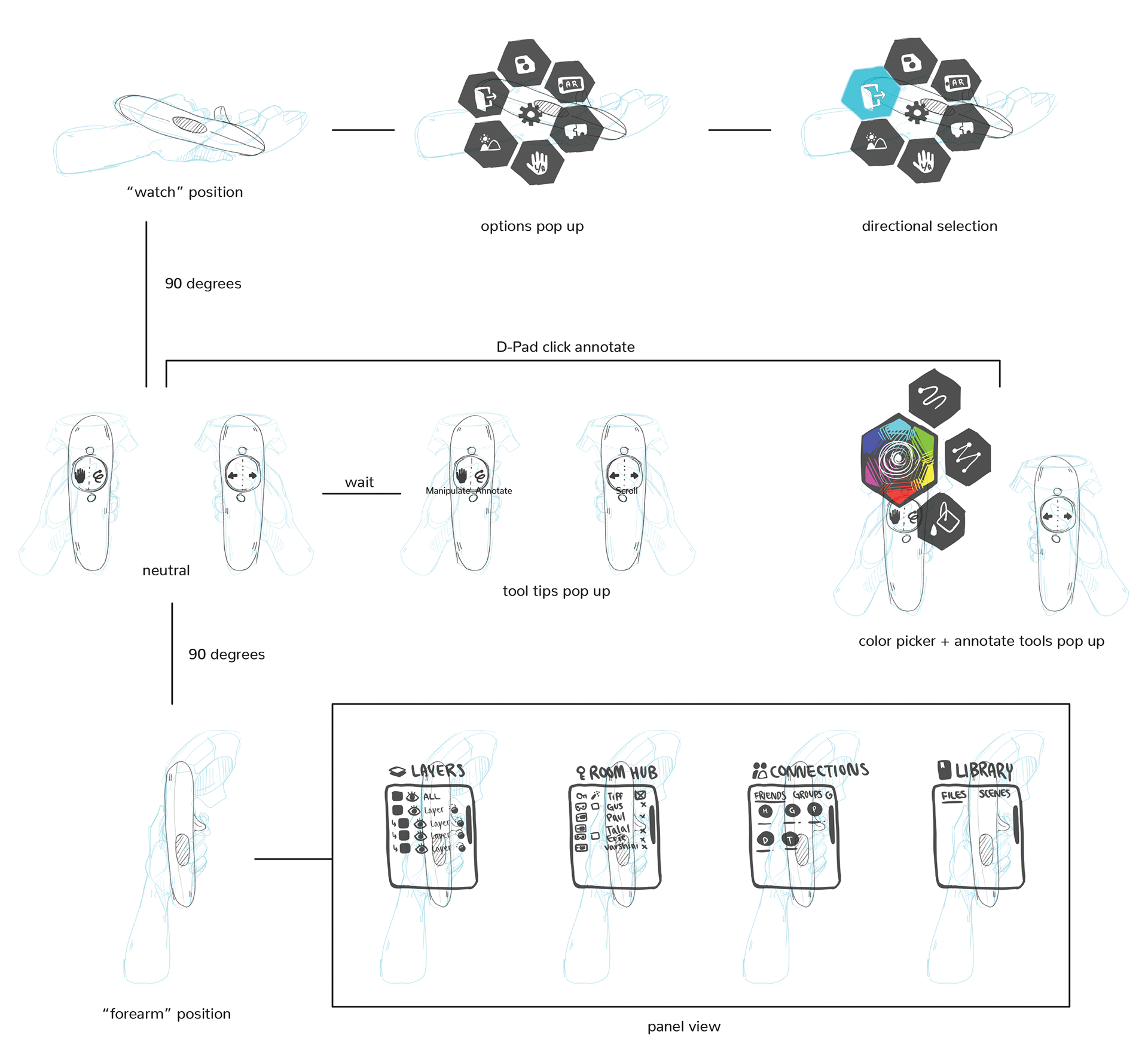
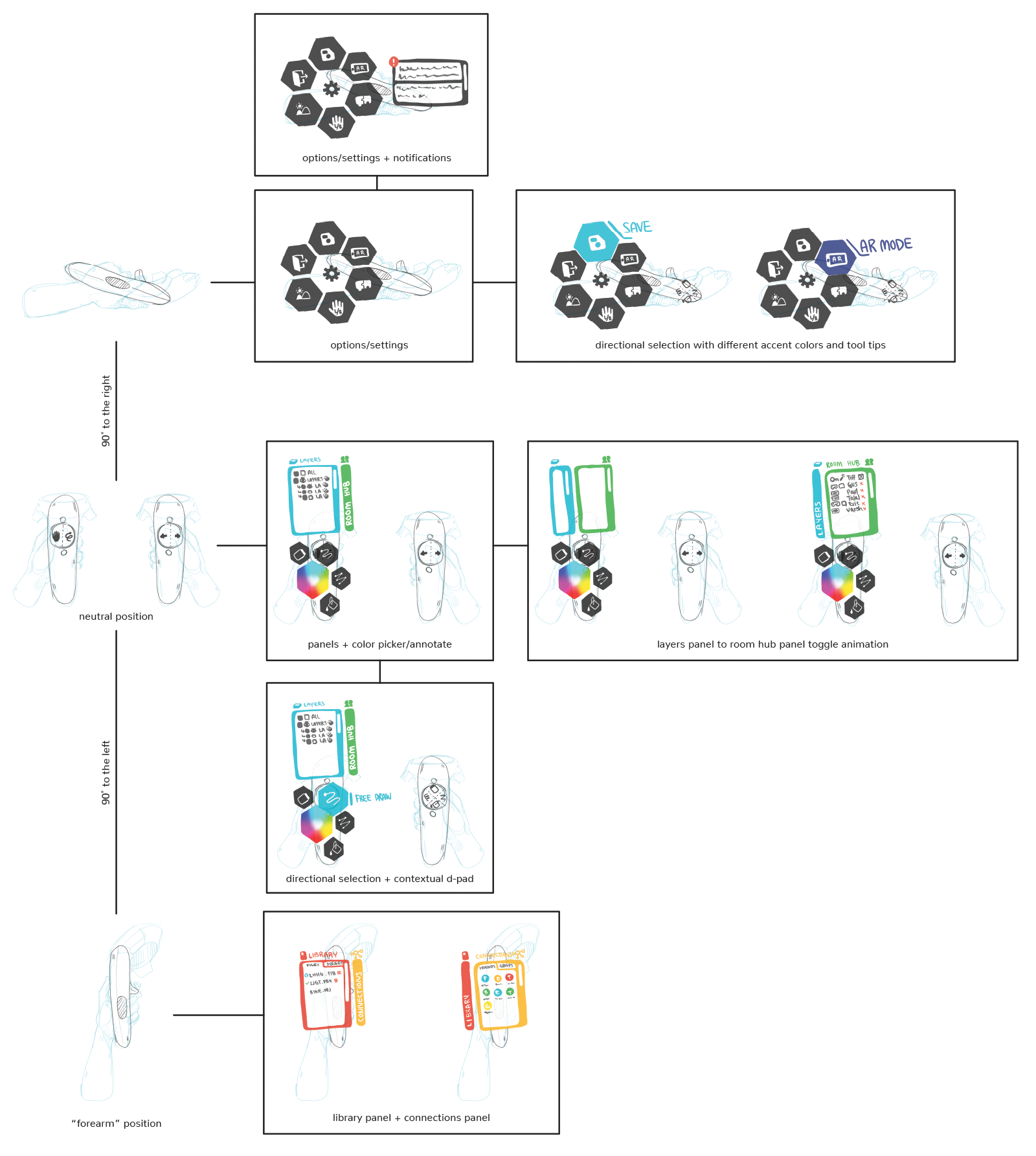
First ideation with UI flow map
This was the first flow map of my own redesign concept, including the positioning of controllers and how menu systems would be mapped to different controller orientations. I was very specific on how I wanted menus to look, referencing my original concept art.
The flow map also showed how all the current features would be laid out in relative to one another. Through this mapping process we were able to methodically include every priority we had listed out.
With this fleshed out in my mind, it was time to meet up with my supervisor and see how we could combine our findings and ideas.
Final UI flow map
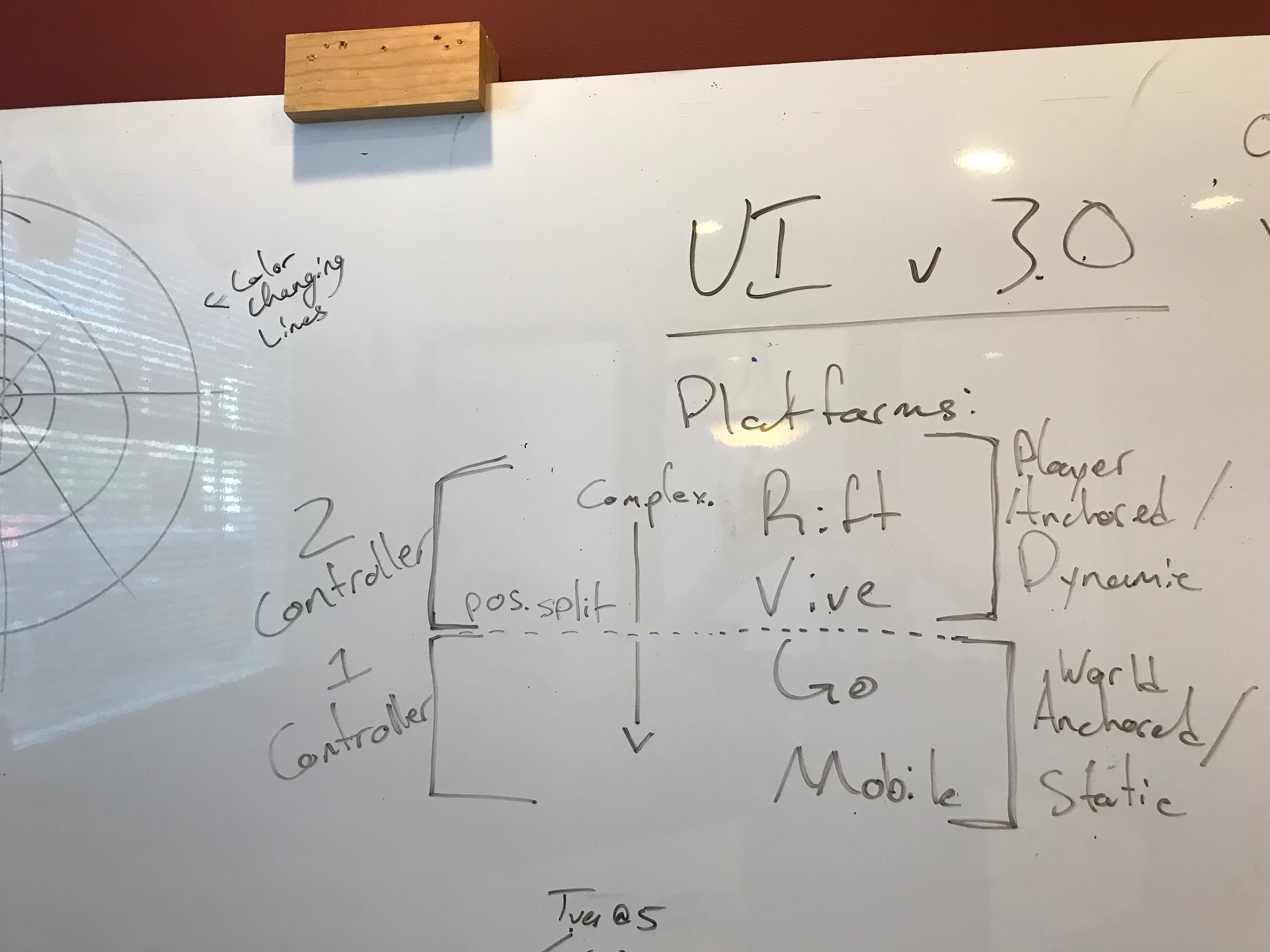
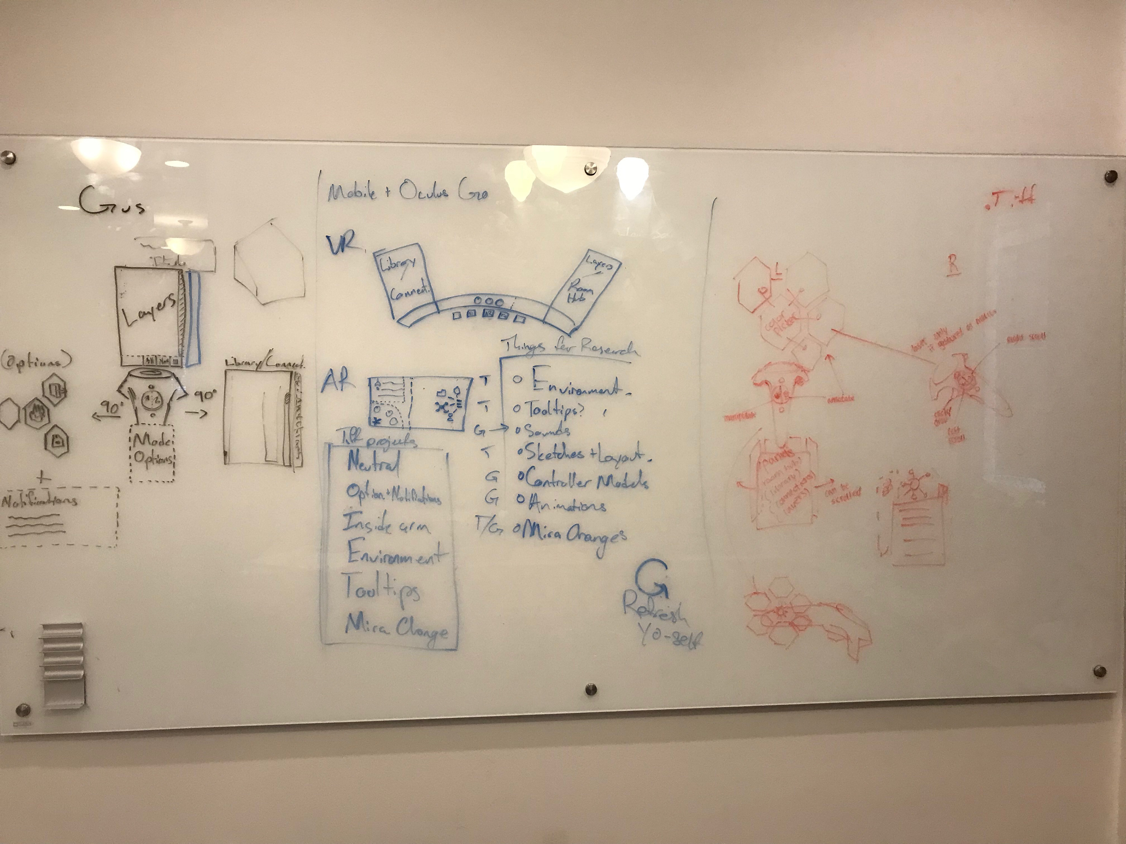
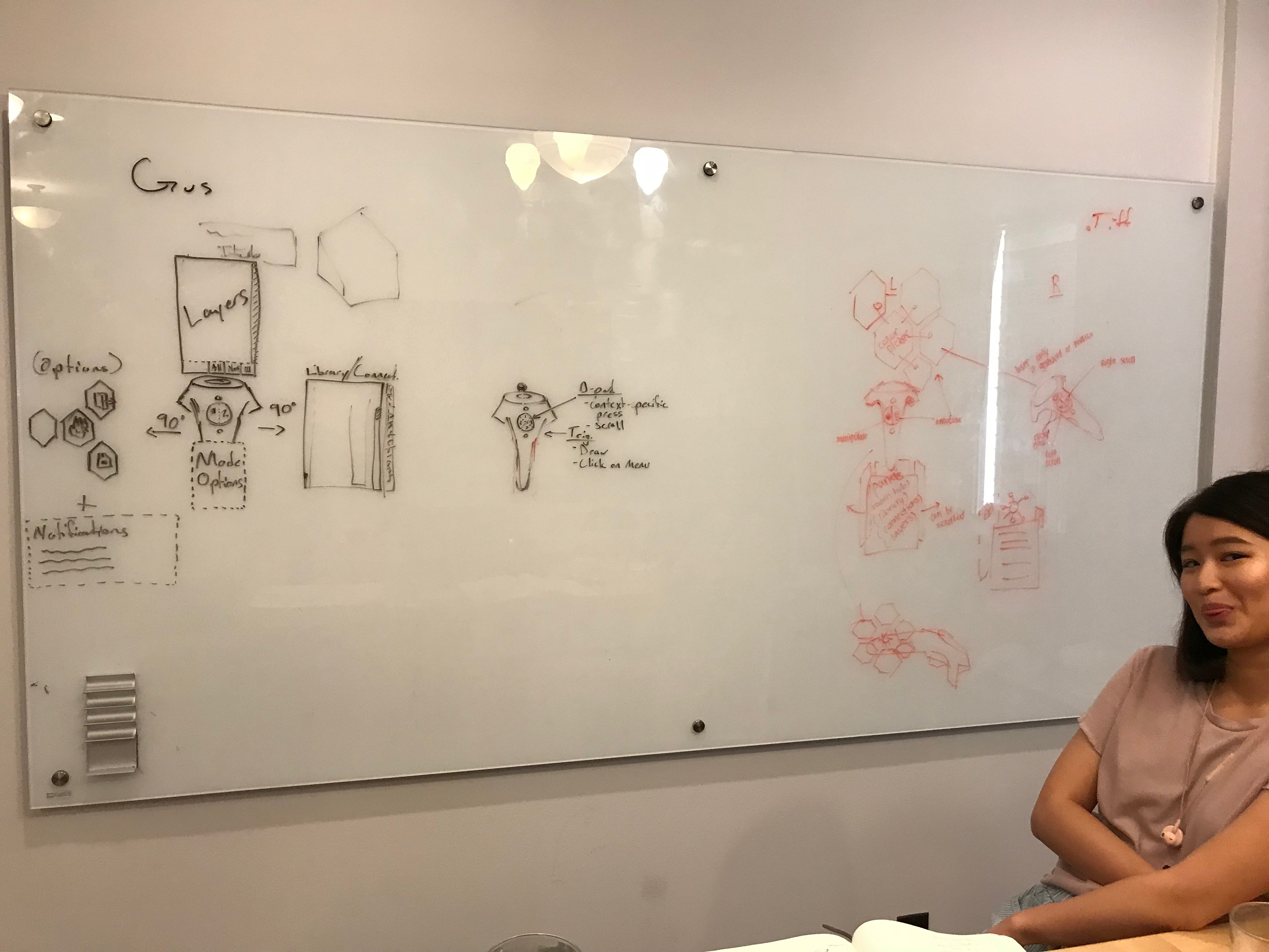
My inexperience with VR UI design showed when I presented my final idea and first flow map to my supervisor. He pointed out a lot of flaws and issues I initially overlooked when I was conceptualizing, bringing up questions and points I didn't even consider. We drew and outlined our ideas side by side on a white board and identified the differences. We were inspired by the same research but also our reasoning for different placements varied a lot.
Ultimately, we were able to combine different facets and aspects from each of our individual ideas to create an improved prototype of how we wanted the final UI to look like. The final concept took a lot of my individualized design characteristics from my flow map but the overall organization from his flow map to create the finalized flow map below.
Creating a cohesive design system
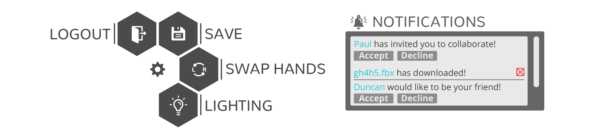
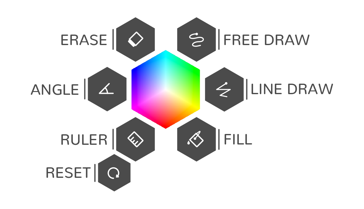
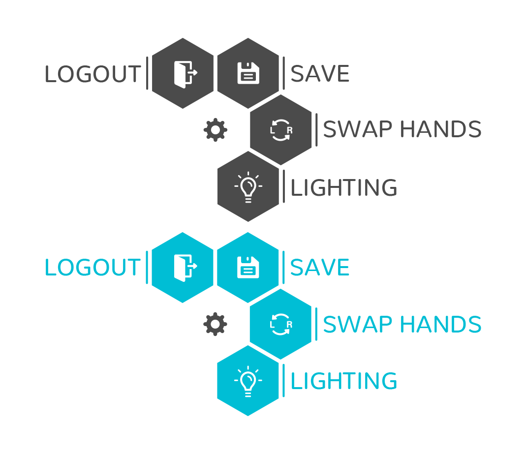
Once the flow map was realized, we quickly realized we needed all the icons to be cohesive and visible in the new environment and panels we were redesigning. While the team had been using some icons already, not every feature utilized an icon, which created a user barrier when text was illegibly small due to VR screen limitations. The new icons needed to be aesthetically cohesive, use thicker lines to be legible, thorough and include every button and feature, and be easy to understand.
I set about redesigning the old icons and creating new icons for both features that didn't have icons before and new features that would be used in the redesigned system.
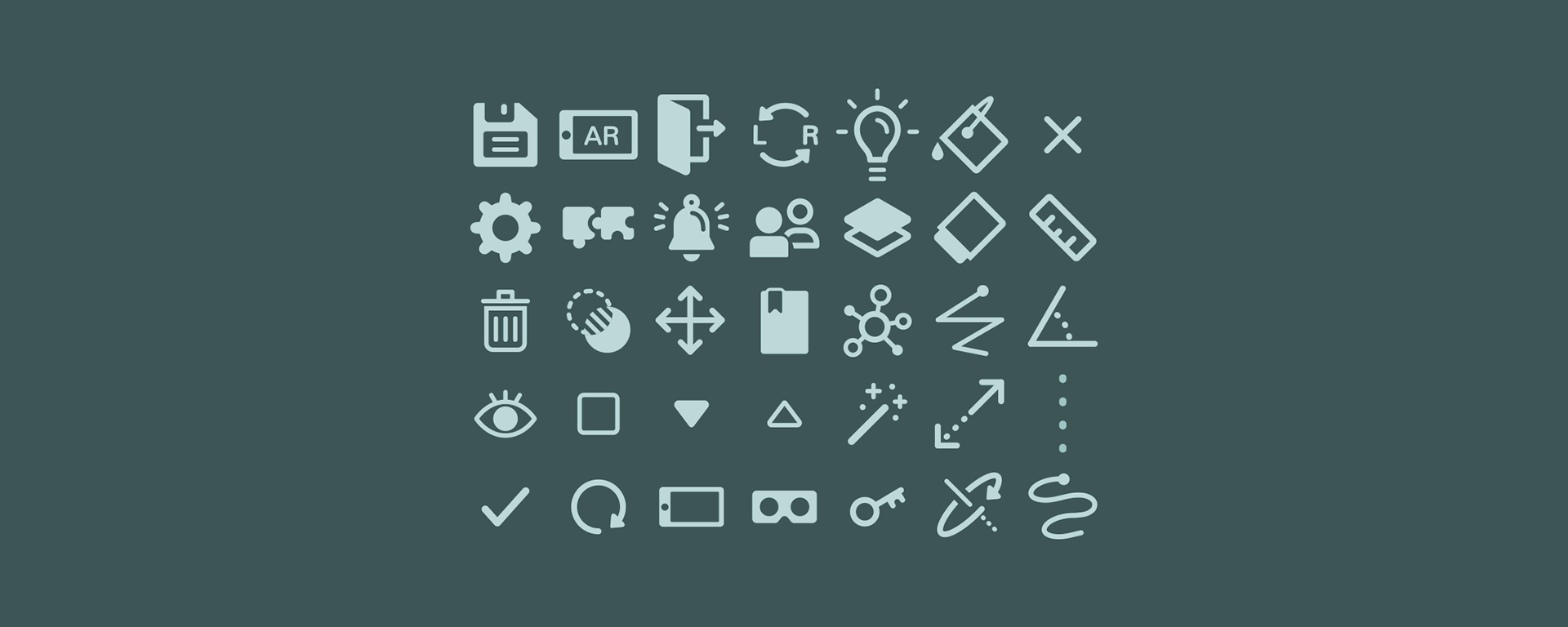
With these icons, I favored rounder corners and a thicker stroke. I wanted to emulate the shapes and curves of our branding typeface, Nunito. I tested different iterations of various icons, asking others in the workplace which iterations were the clearest or if any certain icon needed more clarification. I integrated all the icons into a final sprite sheet for the construction of all the assets and this was the final result.
Constructing final assets
We took what we finalized and pitched the idea to the rest of the team to determine what was actually viable in a reasonable amount of time. Through that we were able to determine what assets were needed for the redesign and what could be shaved off.
I was tasked to create the final assets that would be used by the Development Team in creating the UI redesign. This included making the menus, dialog boxes and even a completely redesigned set of icons representing the different tools and features of Arthea.
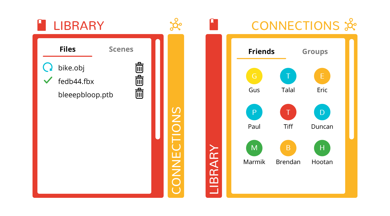
Below also shows the final mockups of how the redesign would look in AR (augmented reality), which involved viewing 3D objects through a mobile device when viewing a tag (similar technology to QR codes). Again, it involved similar design characteristics as the overall UI redesign, just simply tailored to the needs of AR users and environments.
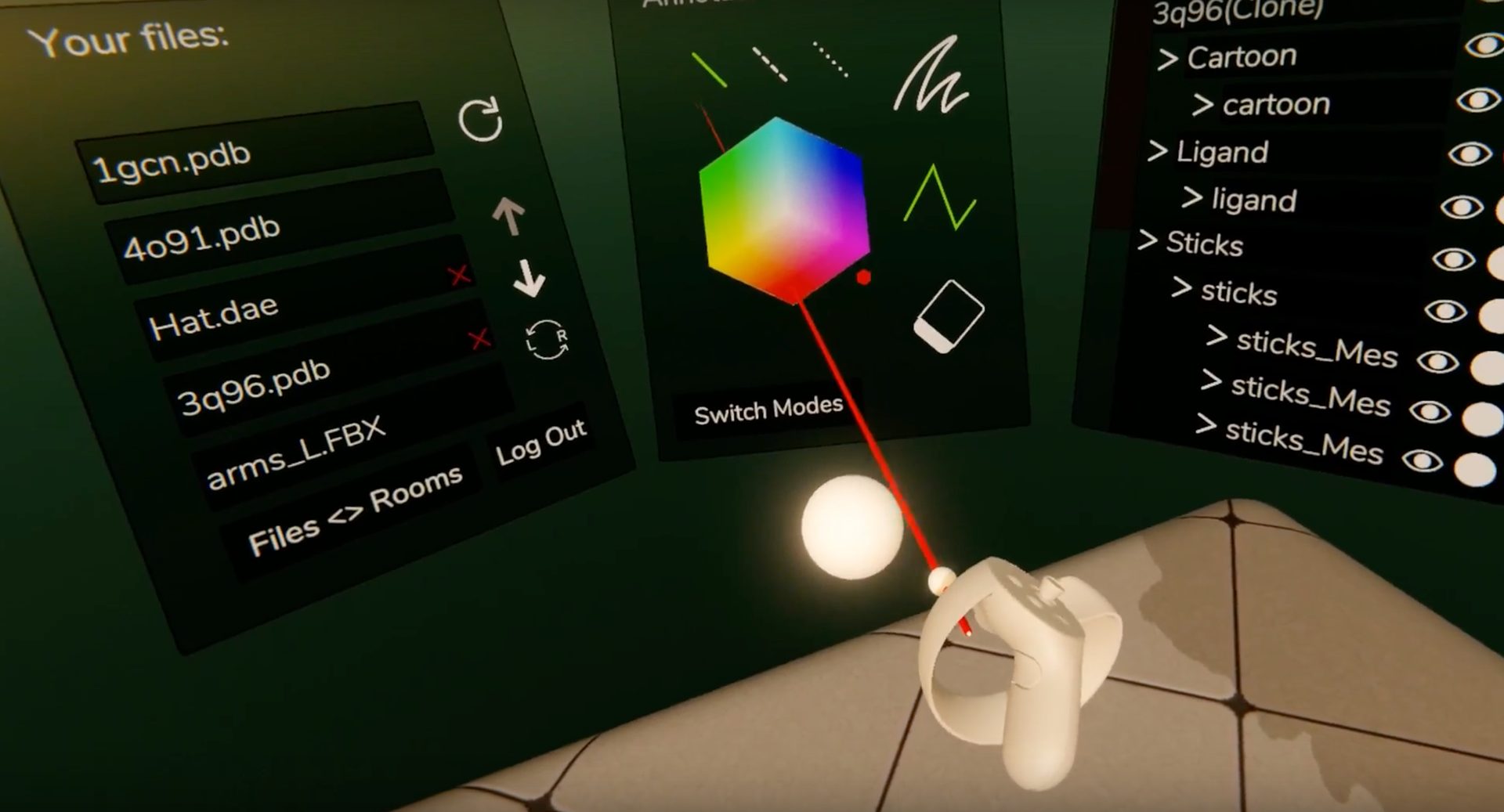
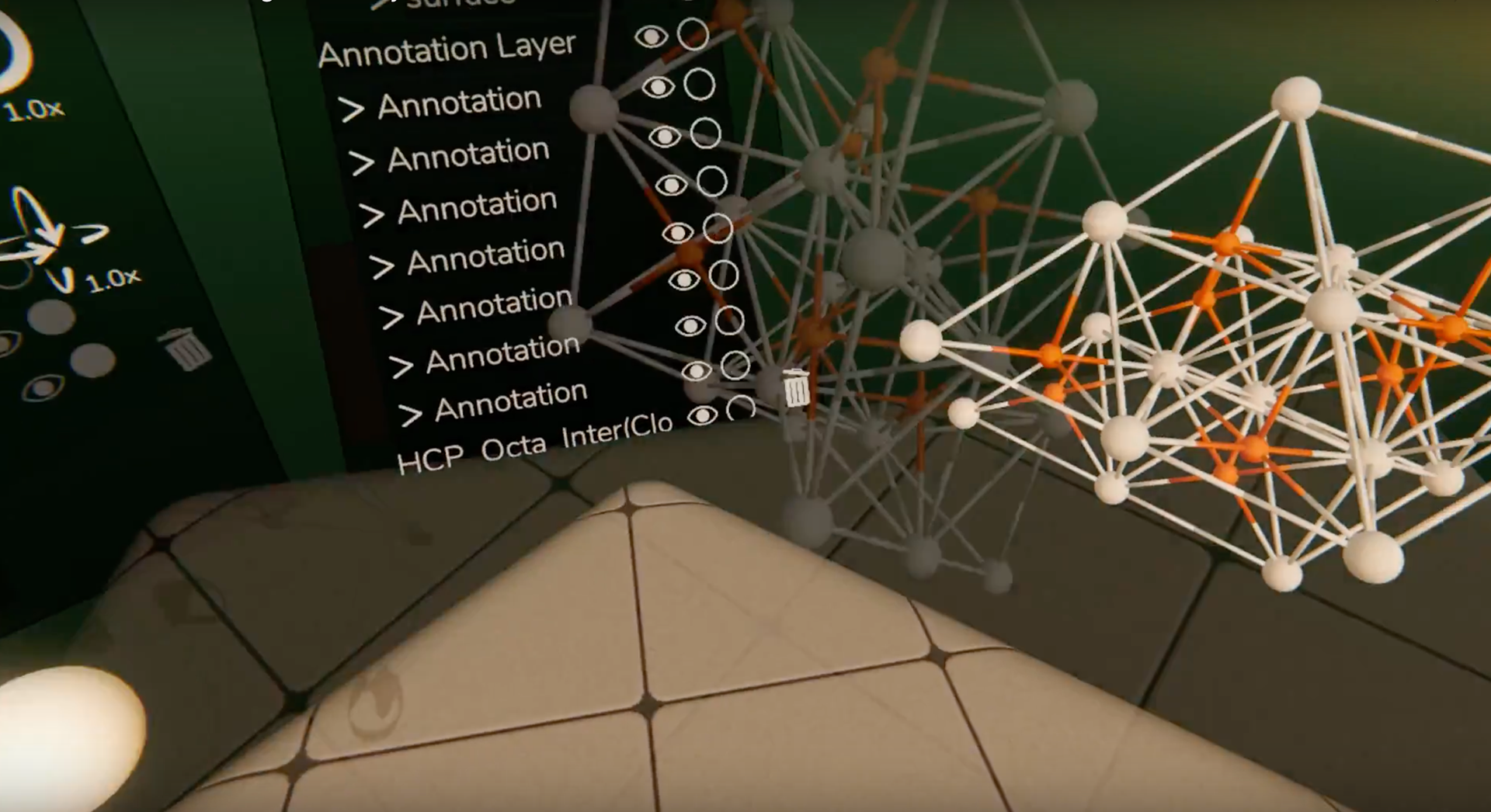
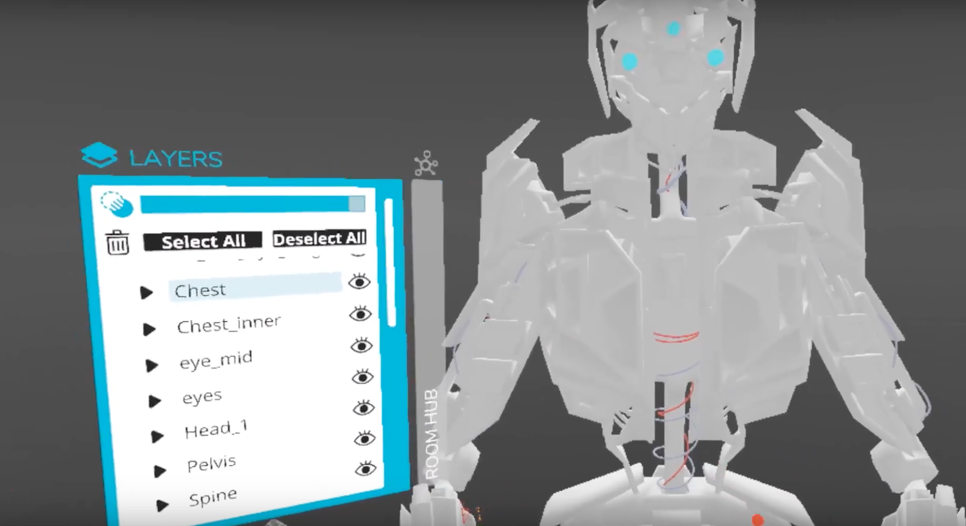
Here are some screenshots of how the final redesign environment and controllers look like in VR as the Development Team worked on them.
Here are some more screenshots of Gwydion's published tutorial videos featuring the dark mode that show the UI being pushed to the public.
Future
Usage
Though I left my internship before I saw public usage of the redesign, I was able to see the tutorial videos and demonstrations of the assets I designed. It was so exciting to see an interface I worked on being used by Gwydion users everywhere. My work on the web platform, on the other hand, had more immediate turnover, where I could help design and integrate new features into the platform and see the functions at work the next day in office. It was deeply satisfying to be able to use my design skills on real world services and products.
Retrospective
I am deeply grateful for my time with Gwydion. It was a great work environment and had great work culture. I learned a lot about design and accessibility during my internship there.
I learned to translate my design skills into a 3D space and began to design for interfaces in new fields that I haven't encountered before. I was also able to practice working in collaborative environments that required me to communicate with developers not just designers, and how to effectively express visual ideas to developers who would turn those visuals into code. The exposure to a multidisciplinary environment cemented my love for collaborative and open workplaces that include design.