Prompt
Exploring the world of Bullet Journaling for project inspiration
During Covid-19 situation, I've been itching to make a personal project revolving around UI and UX design. I've always been interested in approaching productivity in new ways. This time I wanted to explore my newly found journaling hobby and see what potential design opportunities I could discover.
One thing I've been interested in is the Bullet Journal system that has been popular in the past years. It's a completely analog system focused on efficiency and "rapid-logging" but parts of the community have evolved, changing the simple system into a more "aesthetic journaling" experience. Despite originating as a purely manual form, I was interested in translating the visual and aesthetics focused bullet journal concept into a functional mobile experience.
Challenges: Investigating common pain points to pinpoint priorities
Since I knew what topic I wanted to explore, I decided to dive deep in online forums and communities surrounding the Bullet Journaling system. I explored discussion topics in the the subreddit "r/bujo", an affectionate short-hand term for the longer Bullet Journal System. I also watched videos of popular Youtubers who've built a fan base through their Bullet Journal spreads and other journaling videos. After watching and reading, I observed a few common pain points across users.
A large obstacle for many members of the aesthetic bullet journaling community is a certain amount of time and skill threshold needed for journalers to create a suitably attractive result. Some users admit frustration with creating pleasing spreads and layouts in their journals. A large part of bullet journal communities revolve around users sharing and showing off their own creative themes and graphics incorporated in their bullet journal designs, often serving as goals or inspiration for others. The accumulation of beautiful spreads generate the satisfaction and motivation to continue using the bullet journal system. My product aims to make it quick and easy for the users to create a beautiful and visually satisfying journal that is functional and customizable.
Research
Competitive Analysis: What's out there right now and what can
I do differently?
I do differently?
I investigated what the current journaling mobile space looked like. I found many different productivity and note-taking apps that could be repurposed as a bullet journal. Some, such as Taskade, included a Bullet Journal options or templates within their note taking app to save time setting up a bullet journal format within their app. Many of the apps that were compatible with the Bullet Journal format utilized the bullet-based to-do format and didn't have a focus on aesthetics. Apps that do focus on being extra customizable and include cute built-in graphics become more of a freeform journaling app instead of a functional productivity product.
Problem Statement: Reframing what the users need
There seems to be a divide where people sacrifice the aesthetic focus of their journal, leaving behind the initial draw of large communities such as the r/bujo subreddit or the bullet journaling Youtube community. The more functional a journal becomes, the more minimalist in its aesthetic since it takes up unnecessary time to draft up beautiful monthly calendar spreads by hand and ruler. A specific kind of user wants to use the Bullet Journal System to be a better them, with the look and aesthetic of the journal itself motivating and satisfying the user to utilize the system functionally.
"Journalers who don't have enough time or artistic skills need an easy and quick way to set up an attractive but functional
Bullet Journal."
Bullet Journal."
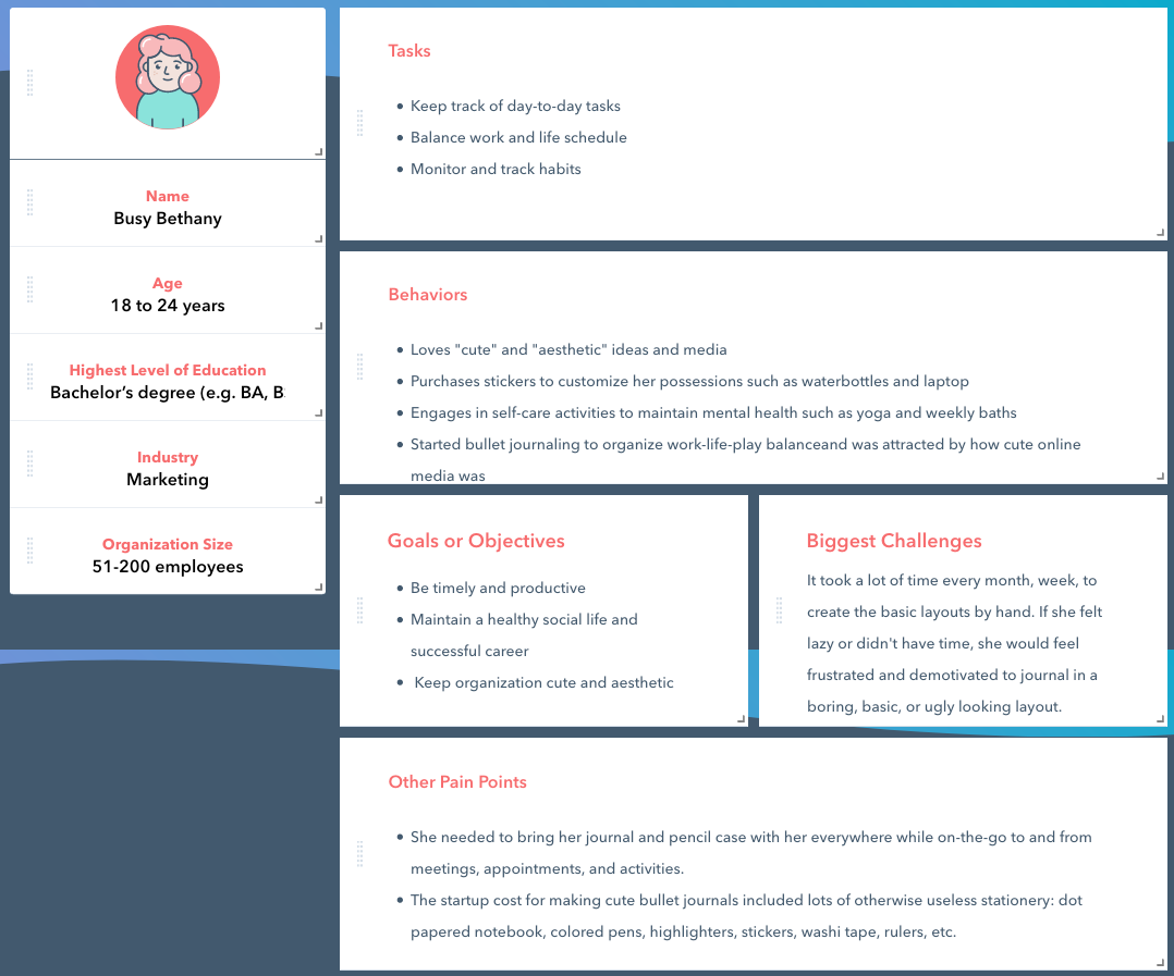
User Persona: Putting everything together accurately and concisely
I started developing a user persona with all the information and observations I've gathered throughout the research process. I utilized a template through hubspot to gather all my final thoughts.
IDEATION
Design Question
How do we make bullet journals an easier and more accessible medium for busy young professionals?
Product Structure
I first defined and prioritized the main functions of the app. I made a series of rough mockups that became increasingly refined, mapping out more detailed features and ideas that nested under the main functions.
Main Features
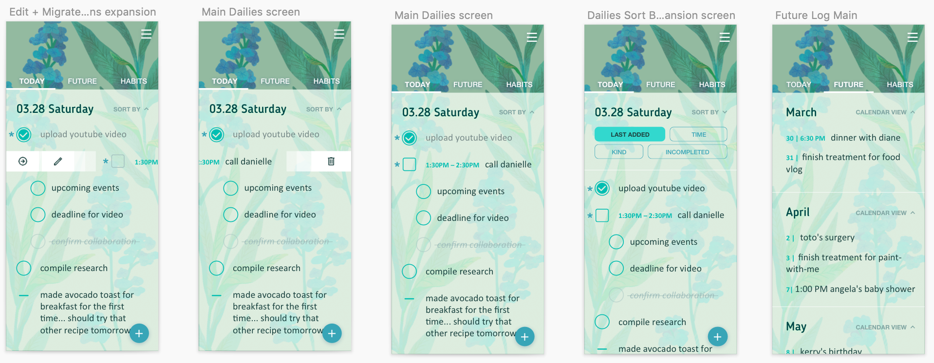
- Rapid logging in a daily log
- Change/categorize/migrate bullet points
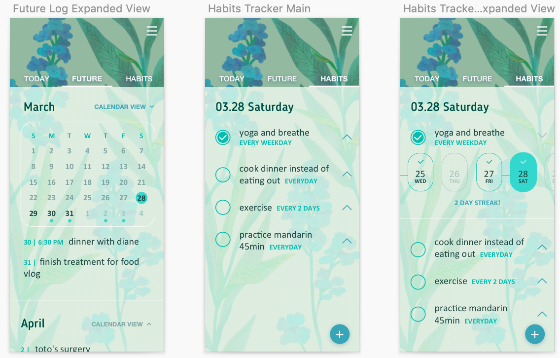
- Future Log
- Habit Tracker
- Sticker and decoration function
- Archive feature
- Rapid logging in a daily log
- Change/categorize/migrate bullet points
- Future Log
- Habit Tracker
- Sticker and decoration function
- Archive feature
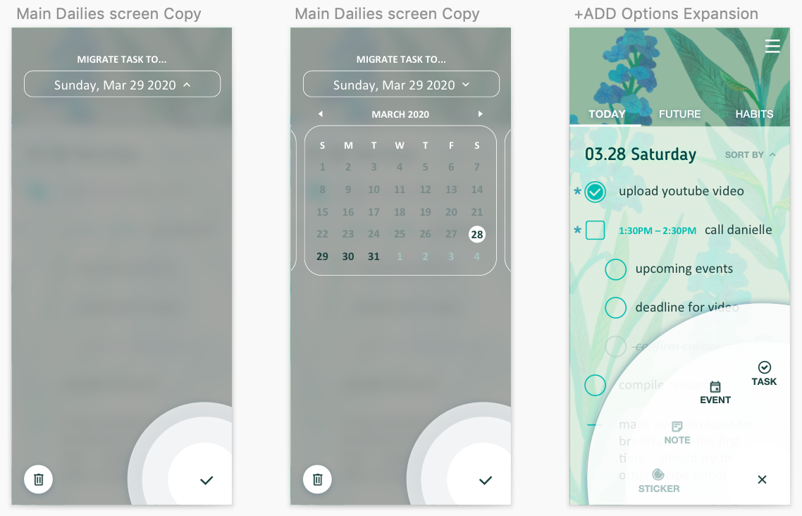
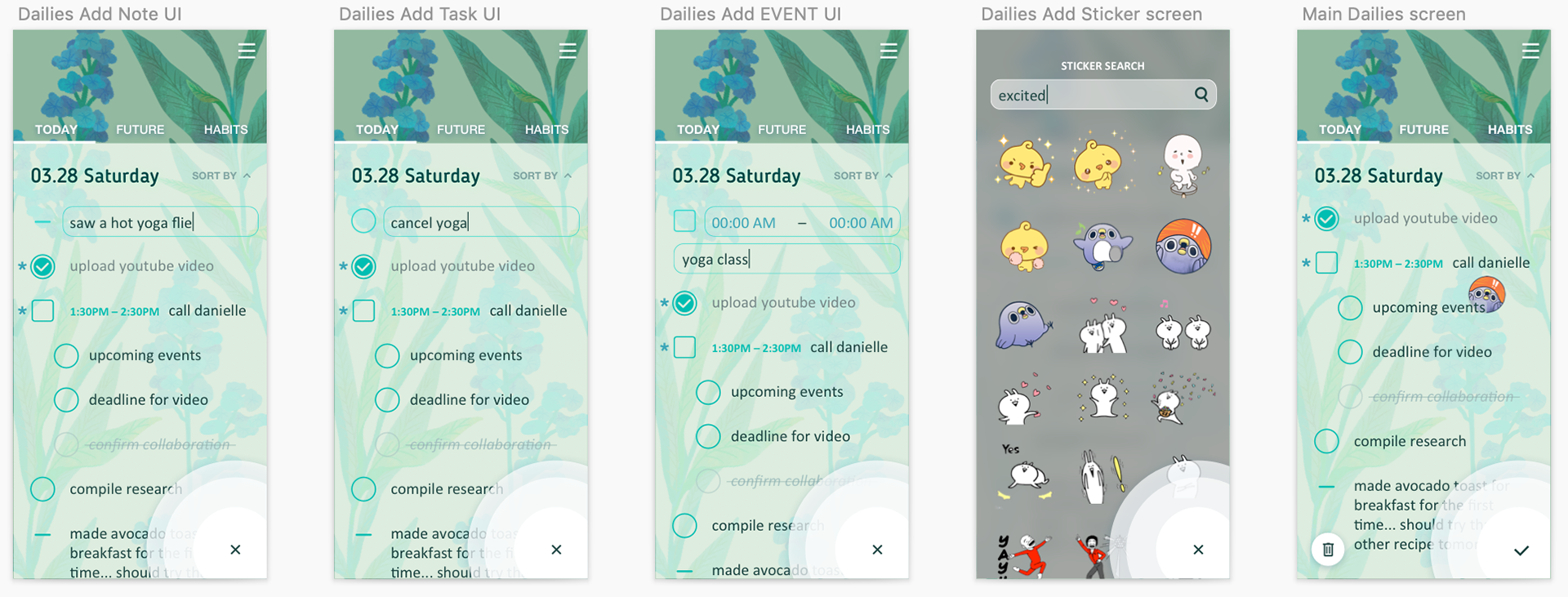
First Prototype
I started by building a barebones wireframe of the most basic screens and with a basic flower as a placeholder icon (not to be taken too seriously). You can see me build out the basic idea of a easy to digest to-do list with added stickers for that customizable affect.
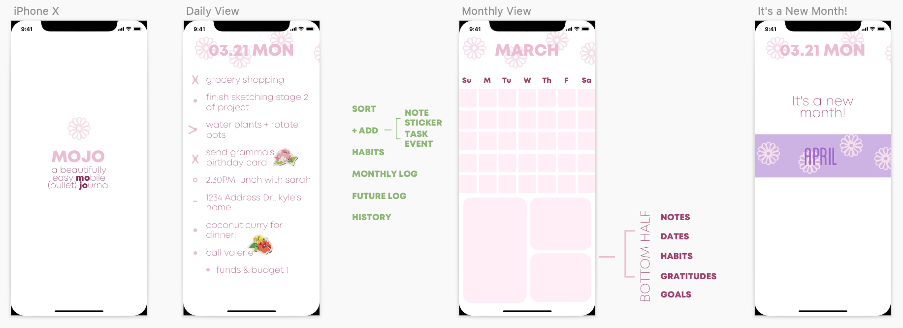
From there I slowly began to build out how a user would be introduced to this app. I had a hard time pinning down a visual concept to move forward with since this product needs to be a blank canvas for the user to impose their own creative nuances to.
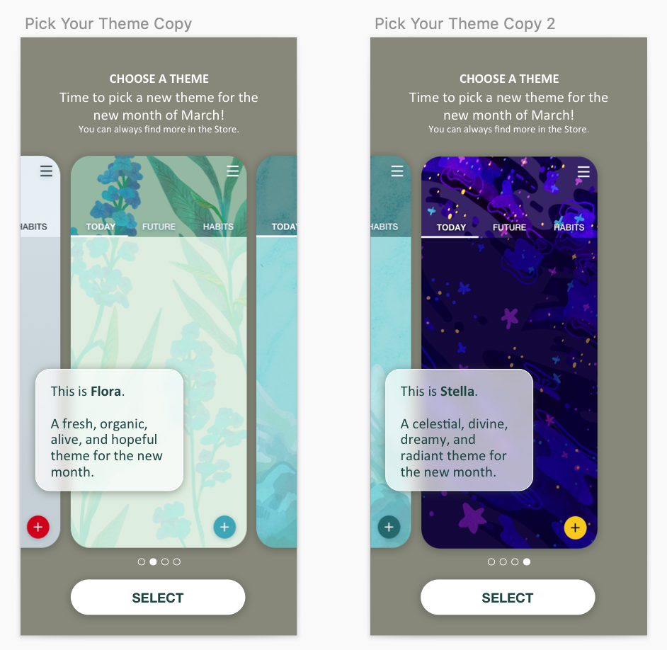
I realized to make the aesthetic process as painless as possible, the product should include some built-in themes, and then allowing for the user to add stickers and cute embellishments on top would satisfy both the creative-choice and quick-and-easy requirements to the product. More themes could be bought through in-app purchases as needed allowing for the product to have a way to earn profit in the long-term.
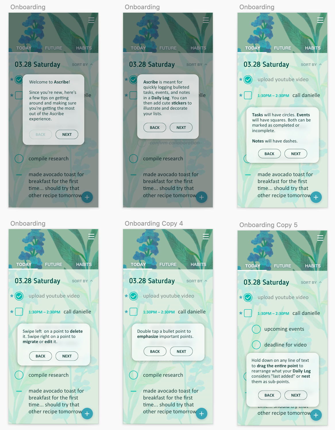
Basic On-Boarding Prototype
I started building out the basic concepts of the on-boarding process which would help construct the product narrative.
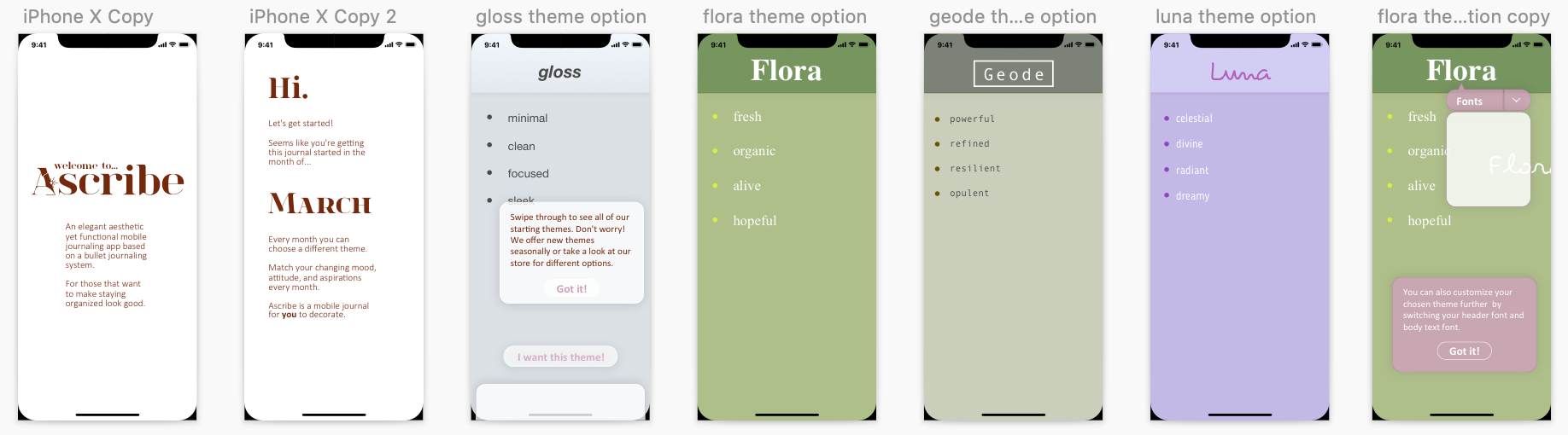
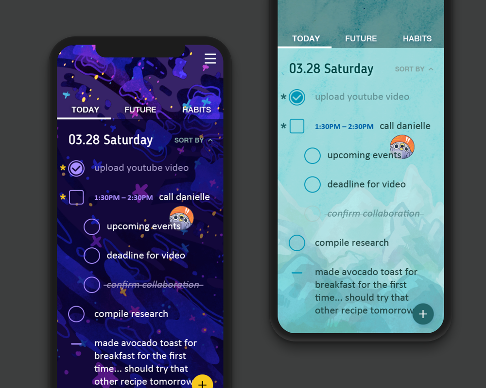
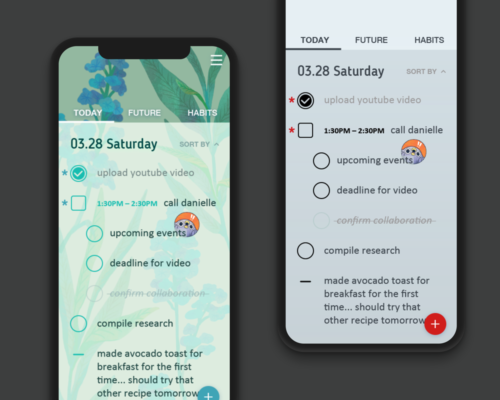
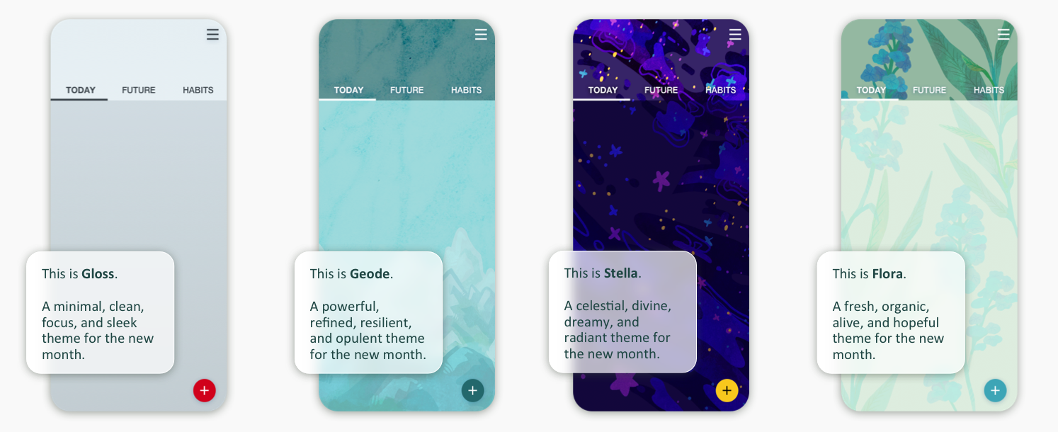
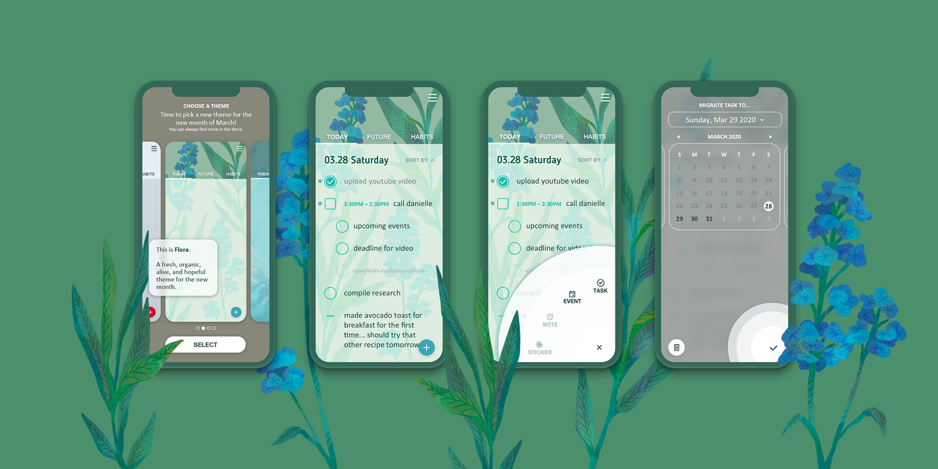
The actual beginning of the app needed to be blank enough that it wouldn't clash with any of the more colorful and unique starting themes. I ascribed 4 distinct but visually popular concepts to each theme to help build the visual expectations: minimalist, botanical, mineral, and celestial.
Final Product
I started designing high fidelity prototypes by creating a style guide for the user interface and building off of the previously designated major screens of the app. We used Sketch for UI design and Framer for a interactive prototype. I ended up building a majority of the screens as a user selecting the Flora theme since it is my personal favorite of the for and presented for interesting design challenges.
Obstacles
A challenge I had was dealing with the habit tracker. I wanted it to be more flexible and include a daily comment section, something that users would be able to write in to add notes and reflection on that day for that habit. I had a difficult time designing around it and how it could fit into the streak tracker without looking clunky. Functionally, I wanted users to be able flick through all their notes chronologically and skim through their emotions and thoughts easily at-a-glance. However, it became more and more bloated of a feature, having to attach an individual commenting space to each day, have it open and close automatically, and still make it easy for users to access, understand, and edit. I realized I was designing for a feature that didn't really need to be there at that complexity level and removed it altogether after designing different iterations of it.
Future
Potential Additions & Improvements
I do have a couple ideas and features that I would want to revisit or introduce to improve this product.
* Revisited comment function for the Habit Tracker
* Additional styles of habit trackers
* Improved functionality of viewing trackers
* Adding Habit comparison graphs or charts
* Adding deadline feature
* Customizing fonts and header fonts
* Additional styles of habit trackers
* Improved functionality of viewing trackers
* Adding Habit comparison graphs or charts
* Adding deadline feature
* Customizing fonts and header fonts
Retrospective
I definitely learned a lot on this personal-project.
Visually and functionally, I'm realizing more and more to not over-complicate things. Simplicity is king. Design is ultimately, for the user. The easier it is to use something the more likely it is to be used. The key is to strike a balance between functionality and a visual elegance that promotes interaction. I struggled a lot with this concept in some of the calendar designs and habit tracking features of the app, and ended up cutting away a lot of the bulk.
I revisited this project over a longer period of time than I would usually since it was my "quarantine pet". I wanted to design something bright and with a lot of interesting visual assets while exploring a topic I was interested in and believe I succeeded.