Context
Multidisciplinary Design Program Project Team
The Multidisciplinary Design Program (MDP) is an experience under the University of Michigan's School of Engineering, allowing students a chance to work together from across fields and collaborate on a project. MDP allows students to apply what we've learned in class to real life design challenges and understand how our skills and lessons function in a professional space.
I heard about this program from a friend and thought this would be a good opportunity to take my education and apply to a collaborative environment where I could learn from students of other disciplines. After applying, I ended up accepting my offer to join the Freespeech Technology team where I would be working with Professor Robert Dick and the rest of the team to develop, design, and market a mobile app device focused on messaging without censorship and surveillance.
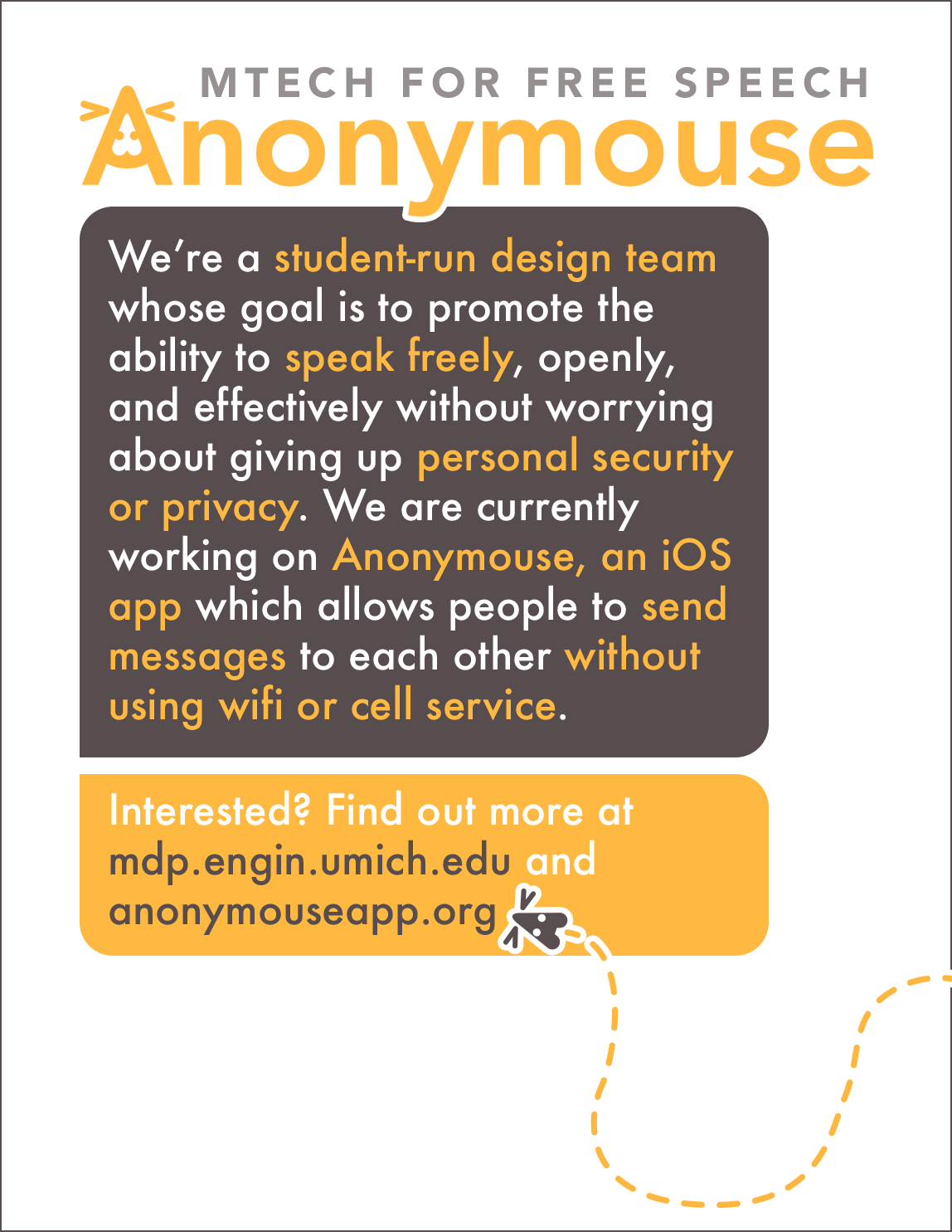
Anonymouse: Anti-Surveillance communication without infrastructure
Titled Anonymouse, the mobile app itself is supposed to run on peer-to-peer technology to enable messaging services without the need for traditional infrastructure such as wi-fi. Still in the making, I came onto the team as a marketing sub-team recruit. I saw that their visual design and branding was a bit underdeveloped and outdated and was excited to work with the rest of the team to develop a new and fresh look for Anonymouse.
Visual Design and Branding

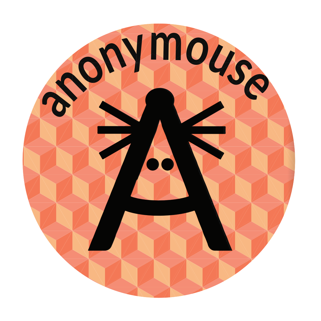
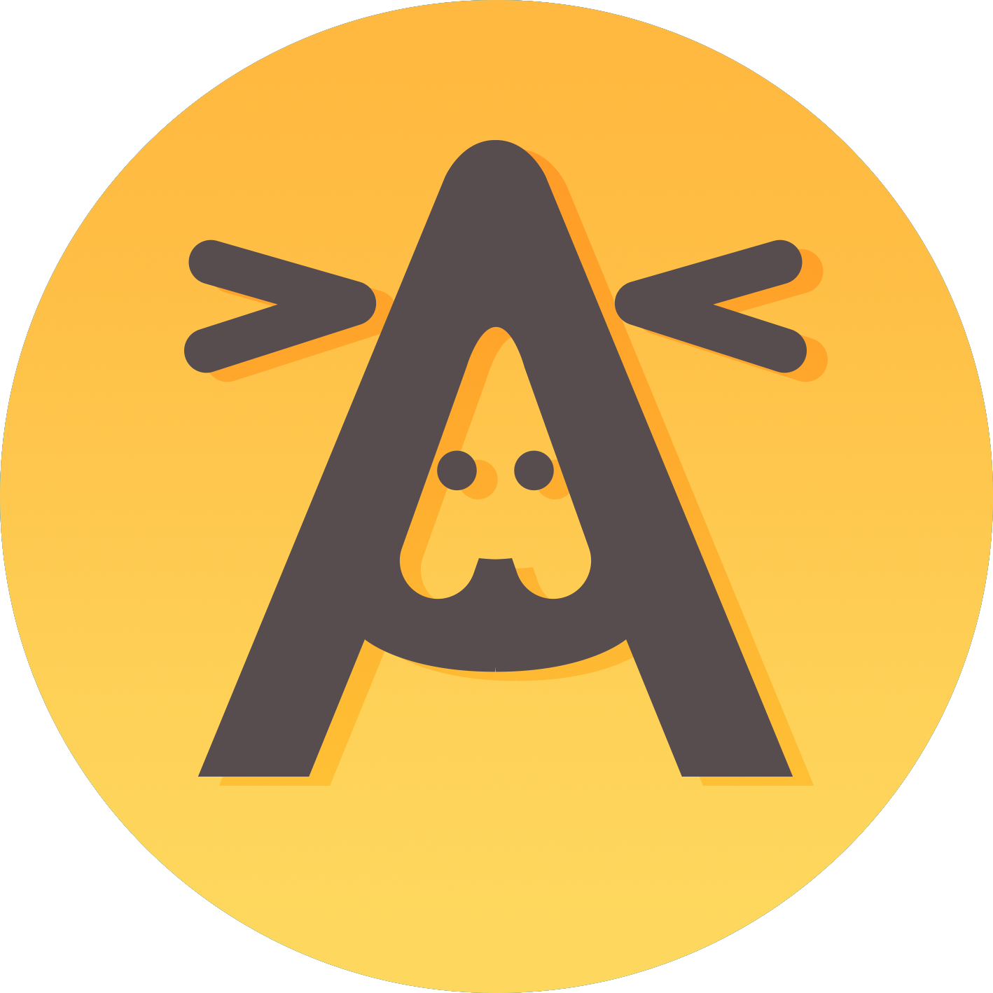
Rapid logo iterations: Updating and improving our product's branding and visual design
I first noticed that the colors of our marketing and advertising media varied from graphic to graphic. The stickers that were distributed, UI colors and the website colors were all different and the overall feel due to the separated color scheme came off as disjointed and not very cohesive.
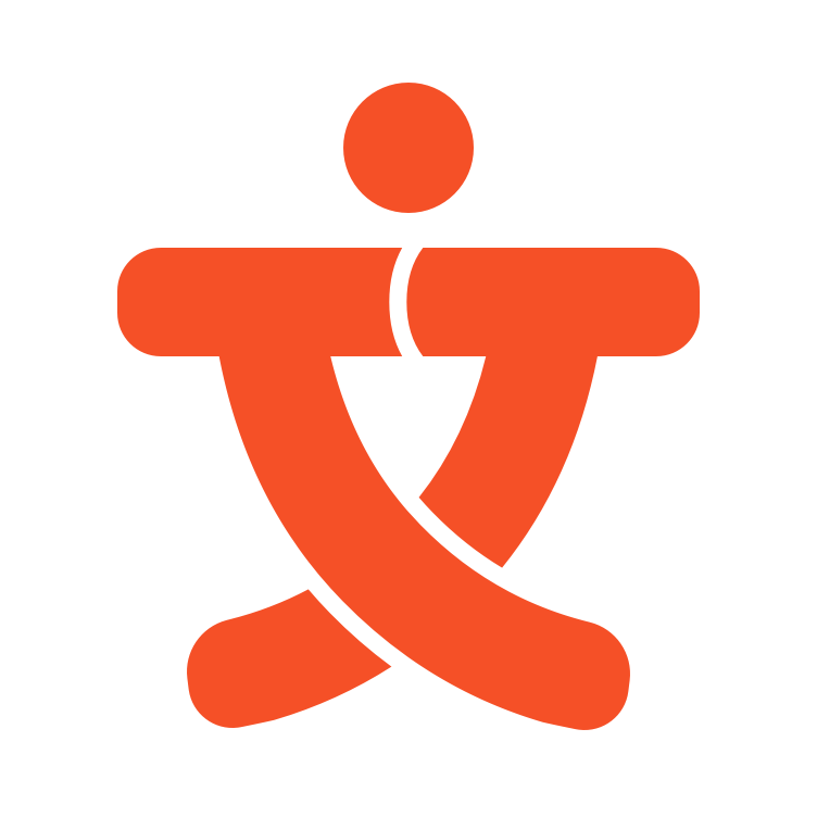
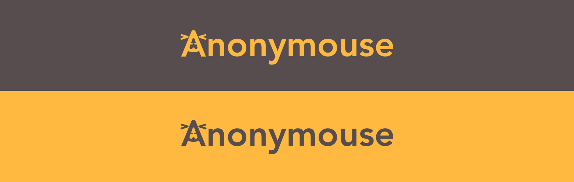
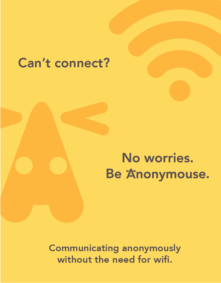
I solidified a simple yellow-orange based color scheme. The warm yellows feel a bit more inviting while setting us apart from other messaging apps. It also ties into the mouse theme being evocative of iconic cheese. The neutral of choice was a warmer gray, which would pair and subdue the yellow to look a bit more professional and sleek.
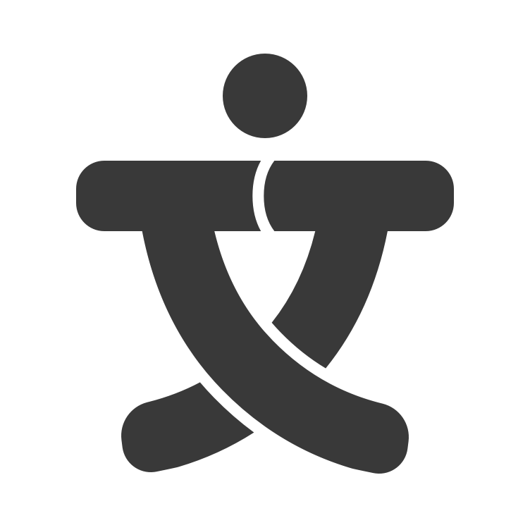
I also thought to update the old logo since it had all sorts of weird contours and imprecise lines. It looked rushed and not very put together.
I modernized the typeface and also placed around with other concepts of representing the mouse icon. We decided to stick with the original plan of simply updating the old logo.
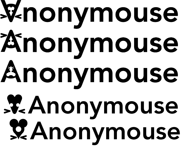
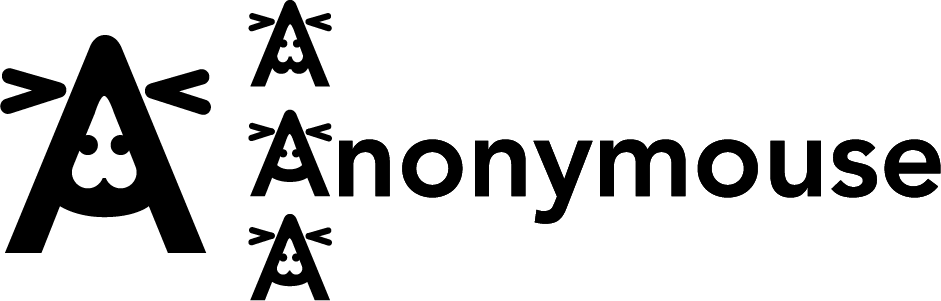
We also played around a bit with how the mouse would fit into the A and small details surround the exact shape.
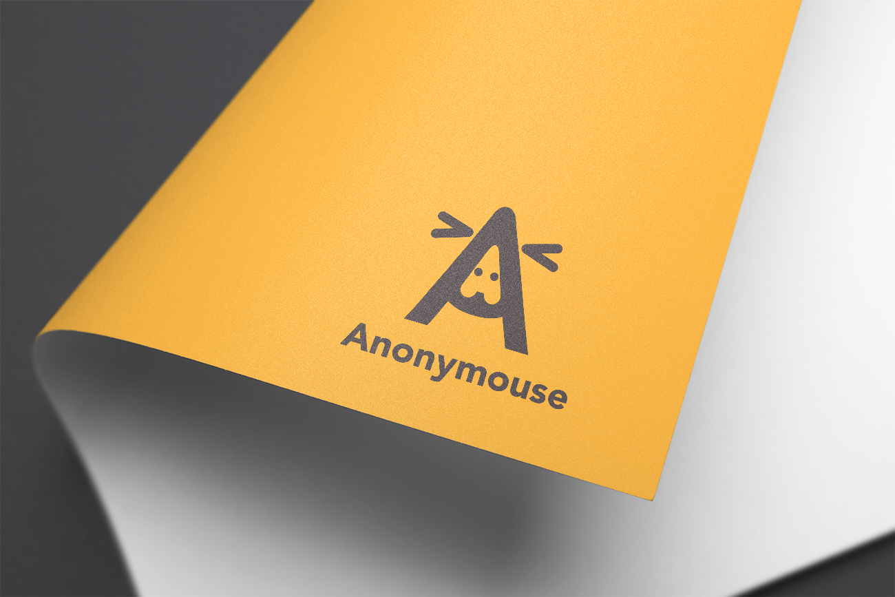
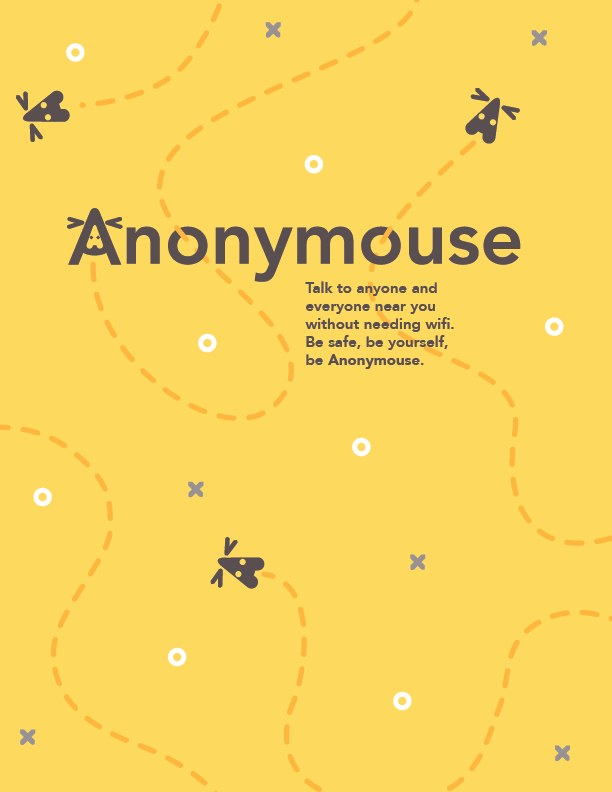
Final branding design: Cohesive and flexible branding with an established color scheme
Ultimately the whole branding came together and I put together a series of conceptual images to present the new look to the team.
Old vs new: Comparison of previous branding and redesigned branding on stickers
Below you can see the old logo on a sticker design on the left and the new logo on our new stickers to the right. We ended up handing many stickers out to potential team members or alpha-testers.
Marketing media: Finding potential project team members and an interested customer base
We also developed a variety of different marketing materials including posters and fliers to hand out at outreach events where we would be recruiting for new team members/alpha-testers for the app or advertising awareness of our project
Below you can see the different styles of media I created for these outreach events..

Recruitment: Outreach efforts and maintaining a
campus presence
campus presence
I lead the outreach efforts during these campus events. Having a different background from many of the other engineering and computer science students on the team, I was tasked with gathering the information from as many interested students as I could and correspond with them accordingly about how to apply to our team or reach information about our product if they were interested. I coordinated the appropriate meeting times and student shifts.

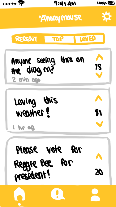
UI/UX Design rough sketch: Building an idea for wireframes
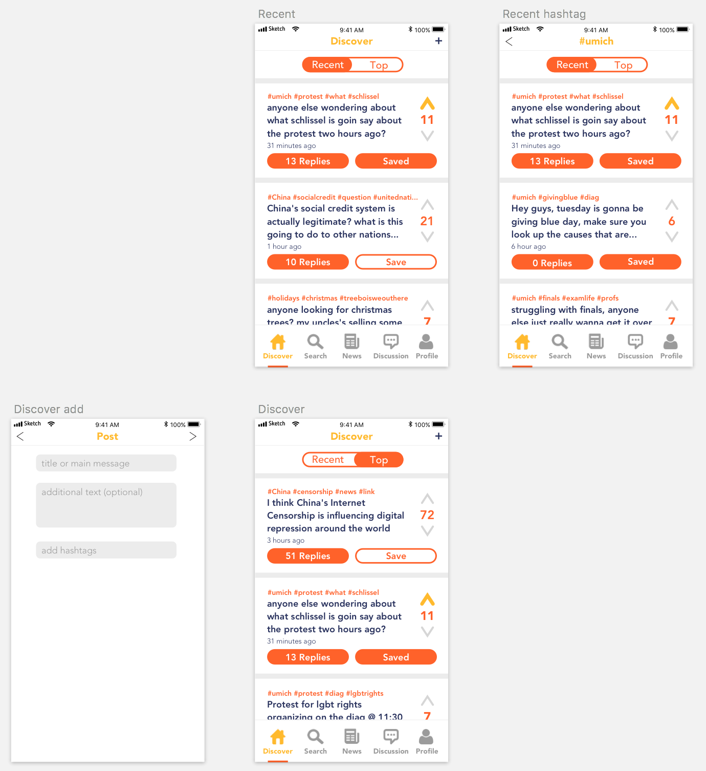
While developing the app, I created a sketch to represent the ideal organization of Anonymouse's different features. I felt as if the UI that the Development Team had been working on didn't always keep in mind user flow and intuitive functionality. After doing research on competitors and other similar apps, I ended up rendering the sketch below to use during alpha-testing to understand how potential users would view and interact with the app.
Second iteration: Nailing down a look and feel with clear functionality and navigation
After some time we began to build more features in such as a search and save feature. I pitched this next set of wireframes to the team as a visual representation of the final design of our idealized product. The app would utilize the social media feature of hashtags to show trending posts and news.
I also introduced an orange red color into the wireframes since yellow would be difficult to read in certain situations. I am still unsure if we should stick to this color as to not conflict with Reddit, another mainstream forum-like/community communication app.
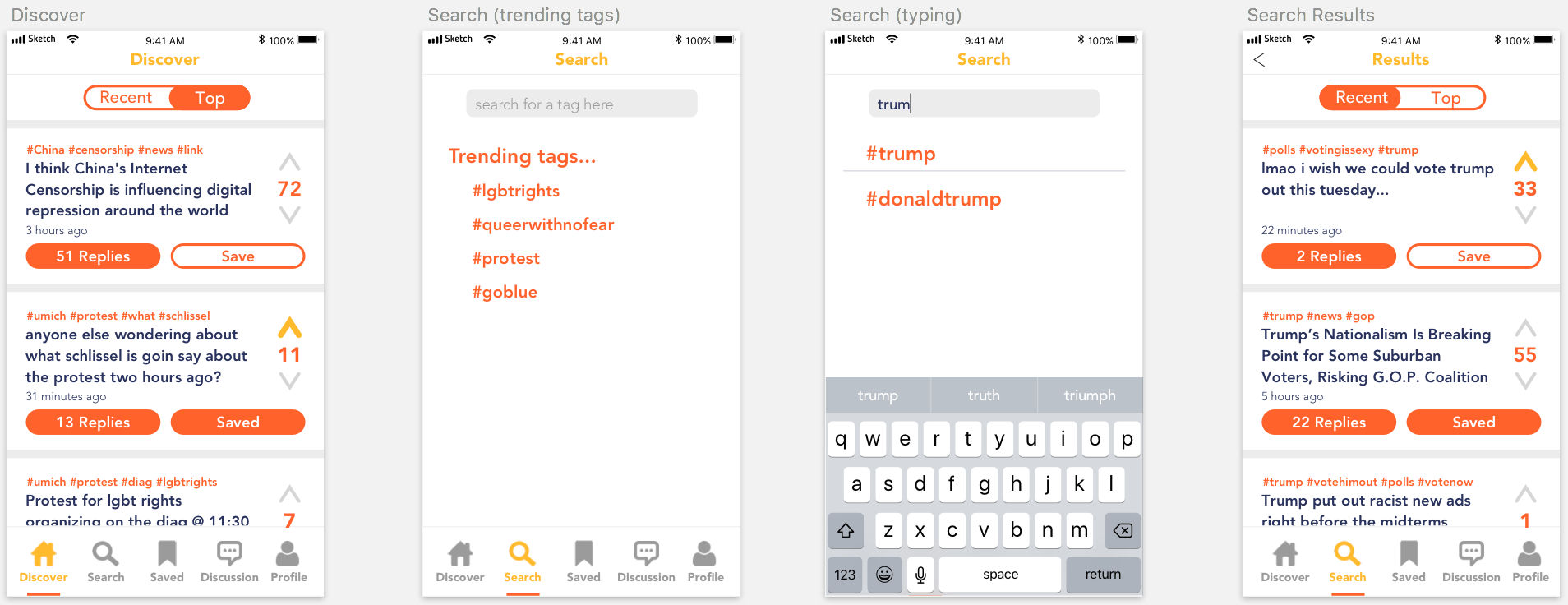
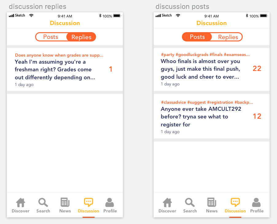
Third & final iteration: Building out additional screens to be used for a clickable prototype
This final iteration is an expansion of the previous version. I created more screens showing the user flow of all the different options in the navigation bar. Additionally, we added a "News" section since the team wanted to see how a separation of news and casual information could be implemented.

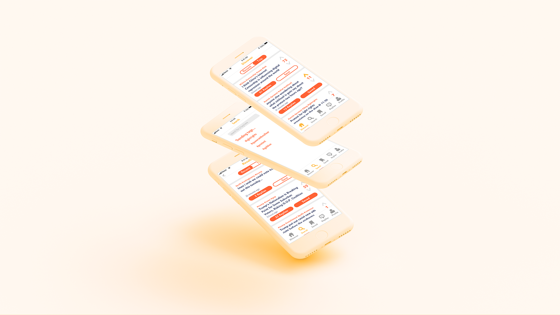
Try it out!
Taking the screens, I created a clickable prototype to be used in future testing sessions and demonstrations for interested users.
FUTURE
Retrospective
Currently, we are still understanding the future and potential of our technology and exactly which direction we should be taking our product. The team is excited and committed to be working on such an opportunity while still in our undergraduate years. I'm hope to adapt our visual design and branding to any new unexpected changes or developments and am excited to continue improving our UI and visual direction.